From those 3 inexpressive people standing in line (for what?) to something so personal that you get to finish the sentence, I think it's a huge step.

 It's time for you to fill out the blanks. I think this logo speaks about what social media should be all about. This comes soon after I complained about the logo design in internet (which usually sucks. no concepts, very basic and boring drawings, no integration, no meaning, nothing). This rebranding comes to tell me it's possible.
Why I like it:
1. it's mine. that makes the difference. I can do what ever I want with it. Now the "my" is much more obvious than before.
2. customizable. It's like a "do it yourself" project (DYI). Like a Lego or a modular house. With a few moves you get something very personalized. It's an invitation. A drawing space.
3. I could search my bag and see what's mine. my lighter, my books, even my life. It's all about me, isn't it?
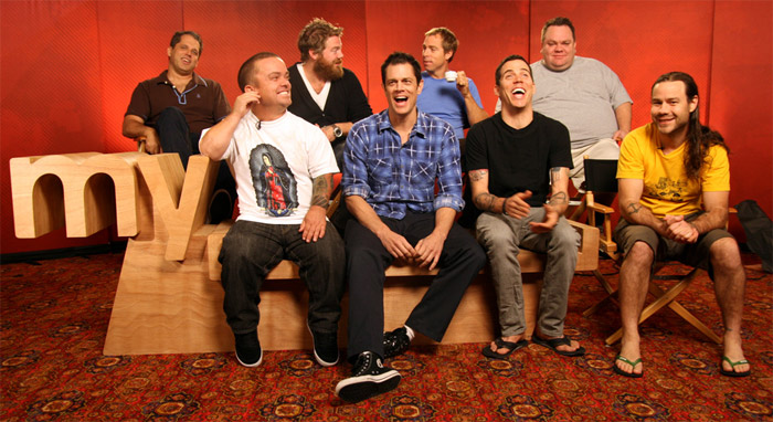
4. gives me a sense of space, real place. Just like in this picture:
 or even out of space.
5. It's one of the best instances where the logo describes what it actually means/says.
6. my place in the space. Find your place in the world.
7. my______ (write your point of view, you get your chance now)
conclusion: my life, my music, my game, my rules.
No comments:
Post a Comment