Aug 31, 2010

keep walking... in 2 (the Johnnie Walker of beer)

A very interesting resemblance with the famous brand Johnnie Walker.


What do you think of this brand? Do you see the similarity, or it's just me?


It's definitely a different style. Johnnie is much more high class - the hat, the cane and body posture. But the similarities are undeniable.
I found some older versions for the Maes Pils logo. It looks like they go back to 1880.


The question is not who was here first, but who has the association. Very helpful at this point would be the opinion of Belgian people. Do they see this, or it's normal for them?

More about the Maes Pils beer: "Maes pils is a brand of Belgian pils brewed by ...." go to http://en.wikipedia.org/wiki/Maes_pils

Aug 30, 2010

eat it !!!

This is a funny way to express eating. I am wondering if it means something. Google doesn't seem to recognized it in any language.


* picture take in Brussels, Belgium - august 2010

Aug 25, 2010

Christiania - the land of free (or three i?)

Believe it or not, it's real - the land of free and a place to dream for a better world, a better life and probably happiness. In the center of Copenhagen, in a huge park area (a squatted military territory) a group of hippies took over. And since 1971 the community is still living there. There were a lot of conflicts with authorities during the last 40 years, but they manage to keep the place as a heaven and a hope for those who need to believe in the idea.
This is a picture taken inside Christiania. What do you think of their life?

They have a few laws: no cars, no hard drugs, no guns, no explosives. And the hole community is: 600 adults, 200 kids, 200 cats, 200 dogs, 17 horses, and a couple of parrots.


But in this post I want to talk about their logo. This is it:

First of all I'm going to say i don't like it. And i will tell you why.
Let me start with the meaning. The 3 dots represent the 3 i's in the name Christiania. The sad part is that this is a very superficial connection, meaningless and disconnected from anything that you will find in there. For a place with so many aspirations and with so many different premises incorporated, it's hard to imagine why they chose something so unoriginal. I think they have something more to say then a plain illustration of the name (which by the way wasn't chosen by them. it was attributed to the place before).
The colors are red and yellow because they found in the ex-military space a large amount of red and yellow paint (wikipedia). I can not imagine why this colors were there, but i like the idea. Practical and symbolic.
The more i think of the design, the more intrigued i am. This community stands for so many things: freedom, hope, humanity, peace, optimism and so on. I really think they could have done better with communicating who they are. Release the freedom from the dots. It's too incarcerating and suffocating.


I think it's too naive and meaningless. But also the draw itself is too strict. Look at the logo below. Belongs to a security company. I think it's more suited for this than the free town. What do you think?

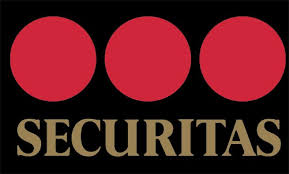
The only advantage of this design is the usability and the diversity of context you can use it and still keep the message and the connection.


Inside the "city" most of the things are branded:


So be free or be three? I choose freedom!

This picture was taken inside Christiania. And I find it so very close to freedom and happiness. I spend 1 hour jumping around. It's the most relevant thing for this place.

UPDATE: the 3 dots could also be an ellipsis (Wikipedia.org: is a mark or series of marks that usually indicate an intentional omission of a word in the original text. An ellipsis can also be used to indicate a pause in speech, an unfinished thought, or, at the end of a sentence, a trailing off into silence.) Like something left unsaid or speechless...

*photos taken in Copenhagen, Denmark - August 2010. Thanks to my good friend Carsten who took the time to take me there and jump on the happiness thing with me.

Aug 24, 2010

bRED

I was very amused by this, so i have to share it. In the first weekend of September in Breda (south Netherlands) there is a two-day festival to celebrate people with natural red hair - Redheadday (Roodharigen in dutch). Just go if it fits you.

A nice word play:

Aug 23, 2010

xxx

You can imagine the shock I had when I was told that this is the flag of Amsterdam.


And just like that all sort of questions came into my mind. Which was first the flag or the xxx movie rating? What does it mean? where does it come from?

My first instinct was to see the xxx symbol relating to the porno industry and also the symbol for dead cartoon characters.


Apparently the 3 Xs (the St. Andrew's cross) stand for the motto of the city: Valor, Resolution, and Mercy. A more popular version refers to the 3 threats of the city: Water, Fire and Pestilence.

The usage of the 3 xs is wide spread, from the official organization like the University to the Red Light District.


All we have to do now is wait for the .xxx domains to be approved.
By the way, do you think the rating system has anything to do with Amsterdam? Or it's just a weird coincidence?


*photo taken in Amsterdam / august 2010

I AMsterdam

Like all big cities, Amsterdam has its own brand. As in Copenhagen case, it uses part of the name to express it. I think everything started with I ♥ NY - the 70's campaign to promote the city. My impression is that the Amsterdam brand has its root in this concept, but it grow in a different direction. The verb "am" is the best part. It makes you feel you belong there, you are part of what's happening.It's the biggest promise a city can make to a visitor - you will be part of who and what I AM. And considering we are talking about Amsterdam, who wouldn't want that?

In the end of august, there is a huge Sail Parade in Amsterdam. The city brand what present in 3 meter tall letters in the street near one view point of the parade. I think is the best expression of what it really means.
People literally become the city. They "live" in it.
Other use of the brand commitment i saw on a bicycle taxi.

I think is the most personal and friendly city brand. In the same time is about diversity. Who are you? You can be whoever you want to be here...
BE AMSTERDAM!!

*photos taken in Amsterdam august 2010

Aug 20, 2010

Thinking of Holland

I love the font they used. You have them in 3 different dimensions, all are readable and memorable.


King of the road

If you can't drive like a king, you can at least park like one.

*photo taken in Amsterdam / august 2010

Blinq

If I would write Blinq, that's how i would write it.

Coke and Fanta ... together?

Mezzo Mix is a product of the Coca-Cola Company sold only in Germany, Switzerland and Austria. Its slogan, translated into English, is "Cola Kisses Orange". It's a "cocktail" from Coca-Cola and Fanta.

It's actually good, but a little weird if you think of the mix.

talking about diversity

the best in Hamburg

I will name this the best for Hamburg.

The first thing that comes into my mind when i see it is that "light can be controlled". We can make it the way we wanted it to be. And that's good for someone selling light design.


* photo taken in Hamburg / august 2010

Just relax

You don't get it more expressive then this. It's the perfect invitation. If you look closely, you'll see the "l" and the "b".

* photo taken in Hamburg / august 2010

Express yourself

Maybe it's the old slogan for Lavazza, but i think it's very inspiring. It talks also about the possibilities of coffee you can actually have or about the wishes you have for yourself.