Sep 13, 2011

The colors of Paris

As all cities are, Paris in unique in many ways. One of them is the way that people use and see color here. Like in no other place, in Paris the colors are very few and very used. Let me explain this.
The city colors are made by a combination of elements:
1. first are the buildings that are creme / gray (very neutral) with black metal art work in the doors and windows, balconies and on the roofs.


2. There are the cars that are made in black and white. All the cars are either black, white or gray. They are moving very slow on the small streets of Paris. This gives to the city a note of elegance. Very rare you see a car thats green or pink or some weird color that is very acceptable here, but not on cars.

3. Another moving element are the scooters. As you probably know Paris is a city of scooters. Is the compromise of technology with the bohemian spirit around. Mostly you will see women in high hills driving around. They sometimes are a drop of color. Apparently the scoters are the sister that got to keep it's childish preferences. And the helmets are unique. This could be a trend itself.

Adding to this elements are 2 more thing that really bring color to the city.
4. First are the tree, and there are a lot of them. The tree here is plane tree (I don't have a good picture because it's autumn).
But the thing is that nature grows everywhere in Paris, on roofs, on windows, on balconies and in the most unimaginable places you can think of.


And the final straw to this is the color red that the Parisians use a lot. Because everything else is so pale.
And there is this thing about Paris, that is more vivid that any other place: "the interdiction signs". And I'm not joking. You see a lot of "ne pas stationner ici", even on buildings there are a lot of paranoiac signs like this.


For more about this, you can check my future article " The Parisians don't take no for an answer".

5. And there is another red. The red of decoration.


The perfect color of a city: black, white, gray and beige, with rich nature and drops of red. All seasoned with the joy and enthusiasm of people. After my trip to Scandinavian (where I met the coldest people), France is a good exercise. People talking to you just because they have the chance. Smiling and greeting everyone. I like this spirit.

Jul 4, 2011

armonia dentara

Ce mult m-a bucurat sa vad un cabinet stomatologic care sa nu aiba sintagma "dent" in compozitia numelui si totodata sa iti transmita mesajul coerent cu privire la ce se ocupa.
Insa pe plan secundar gasesc pentru logoul de mai sus un mare avantaj si un mare dezavantaj in ceea ce priveste simbolostica.
Sa incepem cu cel negativ. La o privire mai superficiala clapetele negre ale pianului pot fi interpretate drept carii. Va dati seama ce tragedie poate fi aceasta interpretare pentru un brand care cu asta se ocupa?
Interpretarea pozitiva a logoului ma duce cu gandul la armonie si muzicalitate. Armonie dentara poate insemna multe - poate insemna dinti aranjati frumos, fara incalecari, sau dinti sanatosi, sau tot ce inseamana pentru voi armonie.
Cazul asta mi se pare un exemplu tipic de logo controversat si ambele semnificatii mi se par la fel de puternice ca valoare, astfel incat eu as fi renuntat la aceasta propunere , indiferent cat de mare ar fi fost avantajul adus de interpretarea pozitiva.

May 17, 2011

desperados

Ce va spune voua Desperados? Daca ati auzi acum acest cuvant si ati inchide ochii.. Probabil Vestul Salbatic, cowboy, pistoale, Antonio Banderas.... Gresesc?
Ei bine pentru cei care n-au aflat inca, este o bere cu gust de tequila. Probabil vi se pare ciudat, insa va recomand sa o incercati. Este suficient de tare ca bere si e racoritoare. Inca nu-mi dau seama daca targeteaza publicul feminin si vine la concurenta cu berile cu aroma de lamaie (Beck's Lemon si Redd's), sau pentru ca are tequila si alcool 5,5 % nici barbatii nu se dau inapoi.
Am fost la petrecerea de lansare joi (12 mai) si m-am bucurat sa vad un eveniment in care sunt pastrate si promovate anumite valori ale brandului. O tematica daca vreti. Sunt de parere ca se puteau face mult mai multe lucruri, insa ma declar multumita cu ce am vazut si va povestesc si voua.
Desperados este o bere fabricata in Franta, dar fiind o bere cu aroma de tequila elementele reprezentative pentru brand au fost din contextul Mexicului: nisip, iguana, desert + cactusi. Au fost cateva elemente pe care nu le-am inteles, dar va povestesc la sfarsit despre ele.

Asa arata multimea:Asa aratau jocurile de lumini:


Asa arata lampadarul. Pentru cei care nu vad, este construit din sticle de bere Desperados.

Iguane si serpi. Firesc, nu?

Si chiar daca n-au adus un cactus, au reusit sa decoreze spatiul

Au reusit si sa reproduca un coltisor de desert:


Si tatuajele au fost inspirate:

Se intelege ca totul e fierbinte


Si asa arata la sfarsit. Dupa ce s-a consumat bere dupa gustul fiecaruia, dupa 3 concerte incendiare si multa multa lume.

Acum sa trec la ce nu am inteles.
1. ce cautau politistele acolo? Alea deghizate, nu alea reale. Vreau sa stiu cine sunt raufacatorii in toata povestea.


2. De ce se casatoreau oamenii? adica nu e LA..

In rest toate bune si frumoase. A fost memorabil. Cred ca si-au facut o intrare buna pe piata. Si pentru ca e proaspat in mintea mea, nu pot sa nu asociez berea cu Rango. Filmul. Ar fi mers la eveniment niste Mariachi care sa cante o poveste din Vestul Salbatic.
Ce puteau sa mai faca? Sa aduca o planta traditionala din care se face Tequila - "Agave tequilana".

Mar 1, 2011

Prink

L-am vazut in trecere prin Brasov si l-am retinut. Am ajuns acasa si dupa 2 zile l-am cautat pe net. Mi-a starnit curiozitatea si l-am tinut minte. Este un magazin de cerneala. Mi-a placut mult numele: PRINK. Fuziunea intre PRINT si INK. Logoul nu-mi place in mod deosebit. Este imprastiat si vrea sa sugereze un joc de cerneala, dar nu mi se pare reusit. Insa numele te face sa te gandesti la el de fiecare data cand esti pe gol cu cartusul.

Feb 2, 2011

City Branding: Hackerville

Mi-am propus de mult sa pornesc intr-o calatorie pitoreasca, sa ma opresc in orase, mai mari sau mai mici si sa le observ particularitatile, micile diferente care pot fi de bine, dar si de rau.
Sunt orase stigmatizate, care vor pastra mult timp acest branding involuntar. Ma gandesc la : Brasov, Nadlac, Caracal, Costinesti... Tot omul face un concediu la munte la Brasov, la Nadlac nu e doar o granita, este Granita, multe s-au intamplat aici, stiute si nestiute. La Caracal s-a rasturnat carul cu prosti si la Costinesti merge tot studentul sa agate pe cineva. Si exemplele pot continua. Pana la un studiu amanuntit al oraselor din Romania, se pare ca primim recenzii din afara.
Intr-un articol din Wired de ieri orasul Ramnicul Valcea este supranumit "Hackerville". Si pe parcursul articolului este si argumentata aceasta alegere.
Cum in acest oras s-au transmis indeletnicirile de hacker din vecin in vecin si de la coleg la coleg. Pornind de la prima inselaciune de pe ebay in care hotul si-a folosit numele real, pana la o intreaga retea de furt organizat. Articolul se concentreaza pe discrepantele intalnite in oras. Inca de la intrare se infatiseaza o reprezentanta luxoasa Mercedes-Benz, pe strada masinile sunt neasteptat de scumpe si numarul de sucursale Western Union este aproape obositor.
poza copyright Wired - intrarea in Ramnicul Valcea.
Acest articol vine peste multe altele care confirma acesta teorie - la Ramnicul Valcea este un cuib de minti criminale digitale.
Ma intreb acum ce face saracul strain care citeste si el despre Romania si are acces la 3 tipuri de stiri: tiganii din Romania, hakerii din Romania si probabil pe ici pe colo mai aude de saracie si alte pacate. Poate e bine ca informatiile sunt luate din 2 extreme ale modernitatii. Nu poti sa fi si rrom si hacker in acelasi timp. Sper doar sa-si inchipuie ca mai e si ceva la mijloc.
Cine isi mai aduce aminte ca in 99 a fost eclipsa la Ramnicul Valcea? Ca de atunci n-am mai auzit nimic de acest oras. Poate atunci li s-au luminat mintile si li s-a intunecat judecata.

Propun edililor locali sa schimbe stema orasului, sa fie mai contemporana si mai realista. Daca aveti propuneri sunt curioasa sa le ascult.

Jan 28, 2011

Vodafonge vs Orangeone

Orange este dreptunghiul, culoarea, fontul si textul.
Vodafone este cercul, codita (doar cea din stanga), centrul gol si pozitionarea
Si mai este si o portocala la mijloc.
Asta este ceea ce numesc eu amuzant. Demonstratia ca diferentele intre ceea ce consideram noi unic sunt doar o aparenta, barierele si granitele sunt doar in asocierile pe care le facem noi.

Jan 26, 2011

Transfer

Imi place mult noul logo transfer.ro (care nu mai e asa nou). Cred ca este, vizual vorbind, unul dintre cele mai apetisante branduri romanesti. Si pe langa paleta atat de vioaie de culori si de nuante trebuie sa va spun si ce vad eu in designul logoului.
Primul cuvant pe care mi-l inspira este apartenenta. Prin natura desenului inteleg ca "transfer" nu apartine cuiva, el apartie tuturor celor care contribuie la existeta lui. Daca vreti un bun comun, o suprapunere de intentie si participare.
Al doilea lucru pe care il citesc din design este Distributie / Imprastiere. Ajunge dintr-un punct portocaliu intr-unul galben trecand prin mai multe nuante. De la un A la un B. Si daca stam sa ne gandim, asta este si functia siteului. Este un degrade al informatiei. Este ca un time frame al procesului.
Mie personal imi place mult aceast rebranding din motivele enumerate mai sus si din sentimentul pe care mi-l ofera.

Jan 4, 2011

Not just stars, they have crops, PhDs and gold.

When you see the flag, you see them as stars, but in reality they are very different. Like children from the same parents, they all have different personalities but they share some birthdays (like 4th of July)
In an article on 1bog.org they've done a map of what every state (in US) is good at, or what's the worst thing about it. The actual study was made for the purpose of energy efficiency rating for each state. The smiley you will see in the right upper corner refers to the energy friendly policy of that state.
The hole article is interesting because it's the first step for branding. It's the first analyze of the particularities and exception of each area.
Of course you can not brand a state in a negative top, like:
Alaska - the highest suicide rate (even though is a good market for sedatives)
Illinois as the highest gang memberships. Massachusetts as the state with the highest number of speed tickets. But you can definitely sell it as the leading energy efficient policy.
Mississippi as the #1 obesity state.
About Rhode Island I'm not sure if it's a bad thing the marijuana consumption (for branding purpose). Look at Netherlands example.


West Virginia case I guess is the most amusing - No 1 in toothlessness. And a good slogan to go with this is "don't smileeeee" - and this is how the inhabitants become the saddest people in America ;)
You have to admit this is a very peculiar market. Do you know there are some photo cameras that have a feature "smile" and they will take the picture only when the character in the frame will smile (after pressing the shutter button you can wait seconds before the camera detects the smile and takes the picture). Imagine this product don't have such a success in WV.
BUT THERE ARE SOME GOOD POINTS FOR OTHER STATES:

Wealth:
California. I'm not sure if the economy level and the UFO seeing is connected (we should definitely study the phenomena), but who wouldn't want to move to the promise land?
Or Maryland, who seems to be very "merry" on wealth:
And there are states rich in knowledge and brain:

It's good to know that there is more then fried chicken in Kentucky. Largest amount of gold ...eh? How's that for a fact?
Or the highest level of skepticism in the country. Non-religious people moved to Washington.

I guess it's better to live you to it. Imagine what you can do with this information:


Dec 30, 2010

Fashion strikes again

Nici nu putea fi mai adevarat. Cate persoane private de o viata normala datorita modei cunoasteti? Fie ca nu mananca, fie ca nu rezista sa isi cumpere nu stiu ce accesorii si haine si regreta ca si-au cheltuit toti banii intr-un singur loc?
Sunt cu siguranta victime moderne si povestea lor ne atinge.
Brandul de mai jos eu l-as inscrie in categoria de magazine care vand mai multe branduri de haine si incaltaminte. Dar nu pot sa confirm acest lucru, este doar o parere despre ce ar putea sa fie.
Numele este foarte bine ales ca "fashion victim". Un altfel de a spune "noi suntem slabiciunea dumneavoastra". Si amprenta aleasa ca simbol pentru acest brand reuseste sa intareasca pozitia brandului - in primul rand are semnificatia de victima, de cautare, de investigatie si mai are si rolul de amprenta - astfel se pozitioneaza ca un magazin cu personalitate si cu puterea de a "impresiona" si de a "lasa urme".

Dec 19, 2010

a, a, stradaaaa

Numele lasa de dorit, dar simplu fapt ca au transformat A-ul intr-o strada schimba total lucrurile. Am intrat pe site-ul lor, insa nu era nevoie. Fac exact ceea ce arata ca fac. Este unul din brandurile romanesti surprinzator de expresive (insa acest lucru nu sterge amatorismul scris cu litere mari)

Dec 8, 2010

Alexandra Stan forward

Unul dintre putinii artisti la care am vazut o forma de branding vizual. Motivul ales este unul deja exploatat la maxim, dar eu zic ca se se potriveste, are o memorabilitate aparte si este adaptat excelent contextului numelui. Intr-un fel imi aduce aminte de FedEx, doar ca acolo era o sageata foarte bine ascunsa in font si avea cu totul alta semnificatie. In cazul de fata nu este doar un buton de play, este un buton de forward.
Sunt si cateva aspecte discordante ale desineului iar propunerea vizuala de mai sus in nici un caz nu este folosita nici pe site si nici la alte materiale la potentialul pe care il are.

Insa acum vreau sa vorbesc de perceptia numelui de STAN. Prin asociere cu "stand" numele artistei poate induce o nota statica, diametral opus fata de dinamismul muzicii si a propunerii de logo. Bineinteles ca nu vorbim de un proces de naming (in afara de ala de la botez), insa acest apect al perceptie trebuie luat in considerare.


Dec 7, 2010

Adidasex

For those who believe that the name ADIDAS comes from the name of the founder - ADI DASsler, couldn't be more "wrong". The name is an acronym for "All Day I Dream About Sport"or even better for "All Day I Dream About Sex". Actually this is a backronym, because it was made to mean something for the name already existing. ;)

Dec 1, 2010

Molusca

Ce este o MOLUSCA? Este o persoana, de obicei femeie, care te usuca la mall.

Nov 30, 2010

Ai I sau n-ai I

Pentru cei care nu stiu cu cati de "i" se scrie copii, punem la dispozitie un nou set de teste. Sa decline substantivul FBI. A se citi "ef bi ai ai"

Ce inseamna sa iti doresti cand esti mic sa te faci politist? A expirat visul asta. In ziua de azi trebuie sa faci dubla investigare.

Oct 31, 2010

Come back for coffee

Coffee Back este o cafenea in Brasov. Un nume foarte inspirat, o invitatie la o cafea si la o reintoarcere.
Daca va uitati atent, cei 2 F, pozitionati cu fata unul catre celalalt pot fi cititi ca un M, si atunci toata fraza are alt sens - COME BACK.
Asa ca nu-mi ramane decat sa va dedic o melodie:

Oct 21, 2010

Moscow Does Not Believe in Rebranding

I have a great passion for city branding. It's maybe the biggest realistic project for a subject like rebranding. A country is already too big to be summarized, but a city is big enough to give you the chance to come up with something memorable, but true and reality fitted.

Walking the internet I found an article in The Moscow News about Moscow's rebranding and the public talk of the proposals. First I will describe the options and then I will go personal and talk about how I saw Moscow myself.

1.

This is a very noisy logo. But I can see it fit in the Moscow reality in the next cases:
1. The contrast. I think society, people, everything there is guided by this oscillation. From very high to very low.
2. I see buildings. I also see a representation of earthquakes. The best part is that Moscow doesn't know what that means, that's why they have very tall buildings. This image is a good representation of the architecture in Moscow.
3. And then, above all, you have the red star. Nothing left to say here. Very reality like. (I'm not sure if it's very smart choice, but it's definitely a real one)
4. And of course the M from Moscow, and possible the W in the end also.
5. A reasonable use would be if you try to adapt this image to a map, to make the end of each peak a place you should go and visit.

Conclusion: this could be a representative shape for Moscow, but it's hard to see the meanings without a deeper research. Imagine this in graffiti hands.

2.
At first I thought it was a pretty simple design and totally out of context. Who can say he went to Moscow and was hugged by people on the streets? I didn't think so too. But after reading the hole proposal I could understand more of it. Besides the hug that I don't agree (but I could accept it like a wishful thinking), there are 2 other symbols integrated in it that I would like to talk about:
1. There is the round circle. And that is exactly how Moscow looks like. If Saint Petersburg is the by default the square city (all the streets are parallel and perpendicular) Moscow is the city of concentric circles. You can see it on every map, probably the circles of the city growth.
2. The second meaning I was happy to see is the hand shake. They are business people. That was my feeling all the time I was there. The cars, the streets, the attitude, everything about them was yelling - we want to make business, we want to make money. That's why I think that business tourism is more important for them than just tourism and cheeseing for pictures.
Conclusion: I don't think it's healthy to advertise a city like Moscow as friendly, because people will go there and there will be no one speaking English in the streets or at the market, nevertheless hug. But the logo has potential in all the derivation of the business growth.
Oh, and another interesting thing about this proposal was to add a "W" at the end of words and it would rime with Moscow:

3.
This is obviously M for Moscow, but that's about it. It has a lot of usage. The biggest advantage of this is that it can "grow" into almost anything. But i personally don't like it. It's not that I don't like it, it's not much to like. For me this is just a font that would go with all the branding materials.

4.

This is the sophisticated one. For me it looks like a brain. If we go down this path we might get caught in the deepness of the neurons. I think it is a representations of the city map. Maybe the correct way to say it is a brutal representation of the city, even organic. And this brings the "puzzle like" feeling about the city.

Another aspect of this design is that it's very fashionable. A topic very close to Moscow's hearth.
And I can see in the center on the draw a hand holding a hearth. I don't know if this was designed to be there, or it's just the coincidence on shapes, but it's welcomed.

5.


This could be the WWW and the McDonald's of the cities. What it actually is, that's another story. It's a Mmmmm. Do you know what that is? Neither do I, but I can guess is the process you get hungry. And it's in a shape of a smile. So smile, you're on candid camera.

6.
This logo is an invitation to talk about Moscow's problem and possible solutions. It's more an intern statement that a saleable product. I don't think that as a tourist this can speak to me.


And in the end I will write about my view of the city after a visit there. I will start by listing words that come in my mind when thinking of Moscow: round, tall, art and cultural capital, subway, deep undergrounds, fashion, expensive.
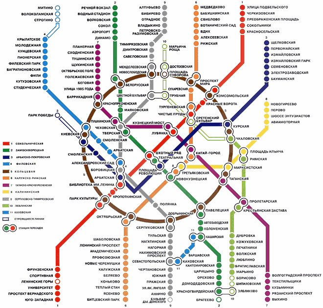
Round because all the city and then the subway is build in concentric circles.
Tall because the buildings are very tall. This is the first thing I saw when I arrived in Moscow:

Art and cultural. I guess I don't need to explain this. It's obvious we are talking about Moscow. I'm just going to share something that impressed me. This are real paintings in a real subway in a normal day:
And the subway. It's spectacular for 2 reasons. First of all they are very deep, you go down on the stairs minutes to get to the station. And there are the stations. To describe them I would say busy museums.
To sum up all I've said, I can see Moscow in 2 different pictures. The first one resembles the first logo proposal with ups and downs only I would symbolize also the ground in the middle, i would make it less rough. The ups should be the buildings and the downs should be the deep subways. But this is purely a draw on a section. It could go as far as be the hearth beat of the city.

The second view i have over Moscow is as an "opened museum" or "outdoor museum" if you prefer.

I guess all it's left to do now is for you to go there and see for yourself. Maybe they will have soon a city-brand to attract you to go there.