Sep 13, 2011

The colors of Paris

As all cities are, Paris in unique in many ways. One of them is the way that people use and see color here. Like in no other place, in Paris the colors are very few and very used. Let me explain this.
The city colors are made by a combination of elements:
1. first are the buildings that are creme / gray (very neutral) with black metal art work in the doors and windows, balconies and on the roofs.


2. There are the cars that are made in black and white. All the cars are either black, white or gray. They are moving very slow on the small streets of Paris. This gives to the city a note of elegance. Very rare you see a car thats green or pink or some weird color that is very acceptable here, but not on cars.

3. Another moving element are the scooters. As you probably know Paris is a city of scooters. Is the compromise of technology with the bohemian spirit around. Mostly you will see women in high hills driving around. They sometimes are a drop of color. Apparently the scoters are the sister that got to keep it's childish preferences. And the helmets are unique. This could be a trend itself.

Adding to this elements are 2 more thing that really bring color to the city.
4. First are the tree, and there are a lot of them. The tree here is plane tree (I don't have a good picture because it's autumn).
But the thing is that nature grows everywhere in Paris, on roofs, on windows, on balconies and in the most unimaginable places you can think of.


And the final straw to this is the color red that the Parisians use a lot. Because everything else is so pale.
And there is this thing about Paris, that is more vivid that any other place: "the interdiction signs". And I'm not joking. You see a lot of "ne pas stationner ici", even on buildings there are a lot of paranoiac signs like this.

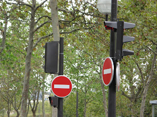

For more about this, you can check my future article " The Parisians don't take no for an answer".

5. And there is another red. The red of decoration.


The perfect color of a city: black, white, gray and beige, with rich nature and drops of red. All seasoned with the joy and enthusiasm of people. After my trip to Scandinavian (where I met the coldest people), France is a good exercise. People talking to you just because they have the chance. Smiling and greeting everyone. I like this spirit.

Jul 4, 2011

armonia dentara

Ce mult m-a bucurat sa vad un cabinet stomatologic care sa nu aiba sintagma "dent" in compozitia numelui si totodata sa iti transmita mesajul coerent cu privire la ce se ocupa.
Insa pe plan secundar gasesc pentru logoul de mai sus un mare avantaj si un mare dezavantaj in ceea ce priveste simbolostica.
Sa incepem cu cel negativ. La o privire mai superficiala clapetele negre ale pianului pot fi interpretate drept carii. Va dati seama ce tragedie poate fi aceasta interpretare pentru un brand care cu asta se ocupa?
Interpretarea pozitiva a logoului ma duce cu gandul la armonie si muzicalitate. Armonie dentara poate insemna multe - poate insemna dinti aranjati frumos, fara incalecari, sau dinti sanatosi, sau tot ce inseamana pentru voi armonie.
Cazul asta mi se pare un exemplu tipic de logo controversat si ambele semnificatii mi se par la fel de puternice ca valoare, astfel incat eu as fi renuntat la aceasta propunere , indiferent cat de mare ar fi fost avantajul adus de interpretarea pozitiva.

May 17, 2011

desperados

Ce va spune voua Desperados? Daca ati auzi acum acest cuvant si ati inchide ochii.. Probabil Vestul Salbatic, cowboy, pistoale, Antonio Banderas.... Gresesc?
Ei bine pentru cei care n-au aflat inca, este o bere cu gust de tequila. Probabil vi se pare ciudat, insa va recomand sa o incercati. Este suficient de tare ca bere si e racoritoare. Inca nu-mi dau seama daca targeteaza publicul feminin si vine la concurenta cu berile cu aroma de lamaie (Beck's Lemon si Redd's), sau pentru ca are tequila si alcool 5,5 % nici barbatii nu se dau inapoi.
Am fost la petrecerea de lansare joi (12 mai) si m-am bucurat sa vad un eveniment in care sunt pastrate si promovate anumite valori ale brandului. O tematica daca vreti. Sunt de parere ca se puteau face mult mai multe lucruri, insa ma declar multumita cu ce am vazut si va povestesc si voua.
Desperados este o bere fabricata in Franta, dar fiind o bere cu aroma de tequila elementele reprezentative pentru brand au fost din contextul Mexicului: nisip, iguana, desert + cactusi. Au fost cateva elemente pe care nu le-am inteles, dar va povestesc la sfarsit despre ele.

Asa arata multimea:Asa aratau jocurile de lumini:


Asa arata lampadarul. Pentru cei care nu vad, este construit din sticle de bere Desperados.

Iguane si serpi. Firesc, nu?

Si chiar daca n-au adus un cactus, au reusit sa decoreze spatiul

Au reusit si sa reproduca un coltisor de desert:


Si tatuajele au fost inspirate:

Se intelege ca totul e fierbinte


Si asa arata la sfarsit. Dupa ce s-a consumat bere dupa gustul fiecaruia, dupa 3 concerte incendiare si multa multa lume.

Acum sa trec la ce nu am inteles.
1. ce cautau politistele acolo? Alea deghizate, nu alea reale. Vreau sa stiu cine sunt raufacatorii in toata povestea.


2. De ce se casatoreau oamenii? adica nu e LA..

In rest toate bune si frumoase. A fost memorabil. Cred ca si-au facut o intrare buna pe piata. Si pentru ca e proaspat in mintea mea, nu pot sa nu asociez berea cu Rango. Filmul. Ar fi mers la eveniment niste Mariachi care sa cante o poveste din Vestul Salbatic.
Ce puteau sa mai faca? Sa aduca o planta traditionala din care se face Tequila - "Agave tequilana".

Mar 1, 2011

Prink

L-am vazut in trecere prin Brasov si l-am retinut. Am ajuns acasa si dupa 2 zile l-am cautat pe net. Mi-a starnit curiozitatea si l-am tinut minte. Este un magazin de cerneala. Mi-a placut mult numele: PRINK. Fuziunea intre PRINT si INK. Logoul nu-mi place in mod deosebit. Este imprastiat si vrea sa sugereze un joc de cerneala, dar nu mi se pare reusit. Insa numele te face sa te gandesti la el de fiecare data cand esti pe gol cu cartusul.

Feb 2, 2011

City Branding: Hackerville

Mi-am propus de mult sa pornesc intr-o calatorie pitoreasca, sa ma opresc in orase, mai mari sau mai mici si sa le observ particularitatile, micile diferente care pot fi de bine, dar si de rau.
Sunt orase stigmatizate, care vor pastra mult timp acest branding involuntar. Ma gandesc la : Brasov, Nadlac, Caracal, Costinesti... Tot omul face un concediu la munte la Brasov, la Nadlac nu e doar o granita, este Granita, multe s-au intamplat aici, stiute si nestiute. La Caracal s-a rasturnat carul cu prosti si la Costinesti merge tot studentul sa agate pe cineva. Si exemplele pot continua. Pana la un studiu amanuntit al oraselor din Romania, se pare ca primim recenzii din afara.
Intr-un articol din Wired de ieri orasul Ramnicul Valcea este supranumit "Hackerville". Si pe parcursul articolului este si argumentata aceasta alegere.
Cum in acest oras s-au transmis indeletnicirile de hacker din vecin in vecin si de la coleg la coleg. Pornind de la prima inselaciune de pe ebay in care hotul si-a folosit numele real, pana la o intreaga retea de furt organizat. Articolul se concentreaza pe discrepantele intalnite in oras. Inca de la intrare se infatiseaza o reprezentanta luxoasa Mercedes-Benz, pe strada masinile sunt neasteptat de scumpe si numarul de sucursale Western Union este aproape obositor.
poza copyright Wired - intrarea in Ramnicul Valcea.
Acest articol vine peste multe altele care confirma acesta teorie - la Ramnicul Valcea este un cuib de minti criminale digitale.
Ma intreb acum ce face saracul strain care citeste si el despre Romania si are acces la 3 tipuri de stiri: tiganii din Romania, hakerii din Romania si probabil pe ici pe colo mai aude de saracie si alte pacate. Poate e bine ca informatiile sunt luate din 2 extreme ale modernitatii. Nu poti sa fi si rrom si hacker in acelasi timp. Sper doar sa-si inchipuie ca mai e si ceva la mijloc.
Cine isi mai aduce aminte ca in 99 a fost eclipsa la Ramnicul Valcea? Ca de atunci n-am mai auzit nimic de acest oras. Poate atunci li s-au luminat mintile si li s-a intunecat judecata.

Propun edililor locali sa schimbe stema orasului, sa fie mai contemporana si mai realista. Daca aveti propuneri sunt curioasa sa le ascult.

Jan 28, 2011

Vodafonge vs Orangeone

Orange este dreptunghiul, culoarea, fontul si textul.
Vodafone este cercul, codita (doar cea din stanga), centrul gol si pozitionarea
Si mai este si o portocala la mijloc.
Asta este ceea ce numesc eu amuzant. Demonstratia ca diferentele intre ceea ce consideram noi unic sunt doar o aparenta, barierele si granitele sunt doar in asocierile pe care le facem noi.

Jan 26, 2011

Transfer

Imi place mult noul logo transfer.ro (care nu mai e asa nou). Cred ca este, vizual vorbind, unul dintre cele mai apetisante branduri romanesti. Si pe langa paleta atat de vioaie de culori si de nuante trebuie sa va spun si ce vad eu in designul logoului.
Primul cuvant pe care mi-l inspira este apartenenta. Prin natura desenului inteleg ca "transfer" nu apartine cuiva, el apartie tuturor celor care contribuie la existeta lui. Daca vreti un bun comun, o suprapunere de intentie si participare.
Al doilea lucru pe care il citesc din design este Distributie / Imprastiere. Ajunge dintr-un punct portocaliu intr-unul galben trecand prin mai multe nuante. De la un A la un B. Si daca stam sa ne gandim, asta este si functia siteului. Este un degrade al informatiei. Este ca un time frame al procesului.
Mie personal imi place mult aceast rebranding din motivele enumerate mai sus si din sentimentul pe care mi-l ofera.

Jan 4, 2011

Not just stars, they have crops, PhDs and gold.

When you see the flag, you see them as stars, but in reality they are very different. Like children from the same parents, they all have different personalities but they share some birthdays (like 4th of July)
In an article on 1bog.org they've done a map of what every state (in US) is good at, or what's the worst thing about it. The actual study was made for the purpose of energy efficiency rating for each state. The smiley you will see in the right upper corner refers to the energy friendly policy of that state.
The hole article is interesting because it's the first step for branding. It's the first analyze of the particularities and exception of each area.
Of course you can not brand a state in a negative top, like:
Alaska - the highest suicide rate (even though is a good market for sedatives)
Illinois as the highest gang memberships. Massachusetts as the state with the highest number of speed tickets. But you can definitely sell it as the leading energy efficient policy.
Mississippi as the #1 obesity state.
About Rhode Island I'm not sure if it's a bad thing the marijuana consumption (for branding purpose). Look at Netherlands example.


West Virginia case I guess is the most amusing - No 1 in toothlessness. And a good slogan to go with this is "don't smileeeee" - and this is how the inhabitants become the saddest people in America ;)
You have to admit this is a very peculiar market. Do you know there are some photo cameras that have a feature "smile" and they will take the picture only when the character in the frame will smile (after pressing the shutter button you can wait seconds before the camera detects the smile and takes the picture). Imagine this product don't have such a success in WV.
BUT THERE ARE SOME GOOD POINTS FOR OTHER STATES:

Wealth:
California. I'm not sure if the economy level and the UFO seeing is connected (we should definitely study the phenomena), but who wouldn't want to move to the promise land?
Or Maryland, who seems to be very "merry" on wealth:
And there are states rich in knowledge and brain:

It's good to know that there is more then fried chicken in Kentucky. Largest amount of gold ...eh? How's that for a fact?
Or the highest level of skepticism in the country. Non-religious people moved to Washington.

I guess it's better to live you to it. Imagine what you can do with this information: