Showing posts with label city brand. Show all posts

Feb 2, 2011

City Branding: Hackerville

Mi-am propus de mult sa pornesc intr-o calatorie pitoreasca, sa ma opresc in orase, mai mari sau mai mici si sa le observ particularitatile, micile diferente care pot fi de bine, dar si de rau.
Sunt orase stigmatizate, care vor pastra mult timp acest branding involuntar. Ma gandesc la : Brasov, Nadlac, Caracal, Costinesti... Tot omul face un concediu la munte la Brasov, la Nadlac nu e doar o granita, este Granita, multe s-au intamplat aici, stiute si nestiute. La Caracal s-a rasturnat carul cu prosti si la Costinesti merge tot studentul sa agate pe cineva. Si exemplele pot continua. Pana la un studiu amanuntit al oraselor din Romania, se pare ca primim recenzii din afara.
Intr-un articol din Wired de ieri orasul Ramnicul Valcea este supranumit "Hackerville". Si pe parcursul articolului este si argumentata aceasta alegere.
Cum in acest oras s-au transmis indeletnicirile de hacker din vecin in vecin si de la coleg la coleg. Pornind de la prima inselaciune de pe ebay in care hotul si-a folosit numele real, pana la o intreaga retea de furt organizat. Articolul se concentreaza pe discrepantele intalnite in oras. Inca de la intrare se infatiseaza o reprezentanta luxoasa Mercedes-Benz, pe strada masinile sunt neasteptat de scumpe si numarul de sucursale Western Union este aproape obositor.
poza copyright Wired - intrarea in Ramnicul Valcea.
Acest articol vine peste multe altele care confirma acesta teorie - la Ramnicul Valcea este un cuib de minti criminale digitale.
Ma intreb acum ce face saracul strain care citeste si el despre Romania si are acces la 3 tipuri de stiri: tiganii din Romania, hakerii din Romania si probabil pe ici pe colo mai aude de saracie si alte pacate. Poate e bine ca informatiile sunt luate din 2 extreme ale modernitatii. Nu poti sa fi si rrom si hacker in acelasi timp. Sper doar sa-si inchipuie ca mai e si ceva la mijloc.
Cine isi mai aduce aminte ca in 99 a fost eclipsa la Ramnicul Valcea? Ca de atunci n-am mai auzit nimic de acest oras. Poate atunci li s-au luminat mintile si li s-a intunecat judecata.

Propun edililor locali sa schimbe stema orasului, sa fie mai contemporana si mai realista. Daca aveti propuneri sunt curioasa sa le ascult.

Oct 21, 2010

Moscow Does Not Believe in Rebranding

I have a great passion for city branding. It's maybe the biggest realistic project for a subject like rebranding. A country is already too big to be summarized, but a city is big enough to give you the chance to come up with something memorable, but true and reality fitted.

Walking the internet I found an article in The Moscow News about Moscow's rebranding and the public talk of the proposals. First I will describe the options and then I will go personal and talk about how I saw Moscow myself.

1.

This is a very noisy logo. But I can see it fit in the Moscow reality in the next cases:
1. The contrast. I think society, people, everything there is guided by this oscillation. From very high to very low.
2. I see buildings. I also see a representation of earthquakes. The best part is that Moscow doesn't know what that means, that's why they have very tall buildings. This image is a good representation of the architecture in Moscow.
3. And then, above all, you have the red star. Nothing left to say here. Very reality like. (I'm not sure if it's very smart choice, but it's definitely a real one)
4. And of course the M from Moscow, and possible the W in the end also.
5. A reasonable use would be if you try to adapt this image to a map, to make the end of each peak a place you should go and visit.

Conclusion: this could be a representative shape for Moscow, but it's hard to see the meanings without a deeper research. Imagine this in graffiti hands.

2.
At first I thought it was a pretty simple design and totally out of context. Who can say he went to Moscow and was hugged by people on the streets? I didn't think so too. But after reading the hole proposal I could understand more of it. Besides the hug that I don't agree (but I could accept it like a wishful thinking), there are 2 other symbols integrated in it that I would like to talk about:
1. There is the round circle. And that is exactly how Moscow looks like. If Saint Petersburg is the by default the square city (all the streets are parallel and perpendicular) Moscow is the city of concentric circles. You can see it on every map, probably the circles of the city growth.
2. The second meaning I was happy to see is the hand shake. They are business people. That was my feeling all the time I was there. The cars, the streets, the attitude, everything about them was yelling - we want to make business, we want to make money. That's why I think that business tourism is more important for them than just tourism and cheeseing for pictures.
Conclusion: I don't think it's healthy to advertise a city like Moscow as friendly, because people will go there and there will be no one speaking English in the streets or at the market, nevertheless hug. But the logo has potential in all the derivation of the business growth.
Oh, and another interesting thing about this proposal was to add a "W" at the end of words and it would rime with Moscow:

3.
This is obviously M for Moscow, but that's about it. It has a lot of usage. The biggest advantage of this is that it can "grow" into almost anything. But i personally don't like it. It's not that I don't like it, it's not much to like. For me this is just a font that would go with all the branding materials.

4.

This is the sophisticated one. For me it looks like a brain. If we go down this path we might get caught in the deepness of the neurons. I think it is a representations of the city map. Maybe the correct way to say it is a brutal representation of the city, even organic. And this brings the "puzzle like" feeling about the city.

Another aspect of this design is that it's very fashionable. A topic very close to Moscow's hearth.
And I can see in the center on the draw a hand holding a hearth. I don't know if this was designed to be there, or it's just the coincidence on shapes, but it's welcomed.

5.


This could be the WWW and the McDonald's of the cities. What it actually is, that's another story. It's a Mmmmm. Do you know what that is? Neither do I, but I can guess is the process you get hungry. And it's in a shape of a smile. So smile, you're on candid camera.

6.
This logo is an invitation to talk about Moscow's problem and possible solutions. It's more an intern statement that a saleable product. I don't think that as a tourist this can speak to me.


And in the end I will write about my view of the city after a visit there. I will start by listing words that come in my mind when thinking of Moscow: round, tall, art and cultural capital, subway, deep undergrounds, fashion, expensive.
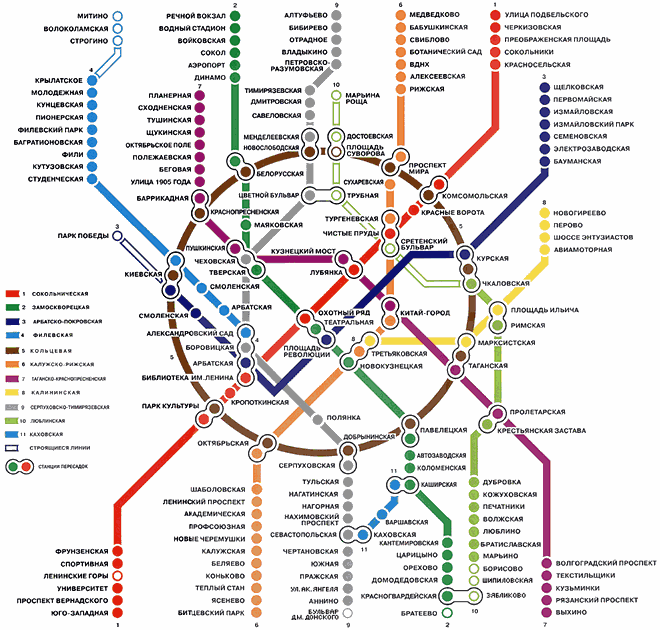
Round because all the city and then the subway is build in concentric circles.

Tall because the buildings are very tall. This is the first thing I saw when I arrived in Moscow:

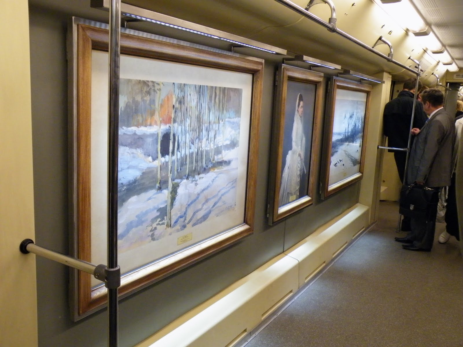
Art and cultural. I guess I don't need to explain this. It's obvious we are talking about Moscow. I'm just going to share something that impressed me. This are real paintings in a real subway in a normal day:
And the subway. It's spectacular for 2 reasons. First of all they are very deep, you go down on the stairs minutes to get to the station. And there are the stations. To describe them I would say busy museums.
To sum up all I've said, I can see Moscow in 2 different pictures. The first one resembles the first logo proposal with ups and downs only I would symbolize also the ground in the middle, i would make it less rough. The ups should be the buildings and the downs should be the deep subways. But this is purely a draw on a section. It could go as far as be the hearth beat of the city.

The second view i have over Moscow is as an "opened museum" or "outdoor museum" if you prefer.

I guess all it's left to do now is for you to go there and see for yourself. Maybe they will have soon a city-brand to attract you to go there.

Sep 4, 2010

pee...

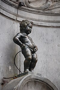
After talking about peace is time to talk about piss. Brussels, pour les connaisseurs. I've been asking myself since i came back from Belgium why would you want to associate the city with a peeing statue (i think is one of the greatest touristic attraction in Brussels, after the Grote Markt). I'm talking about Manneken Piss.

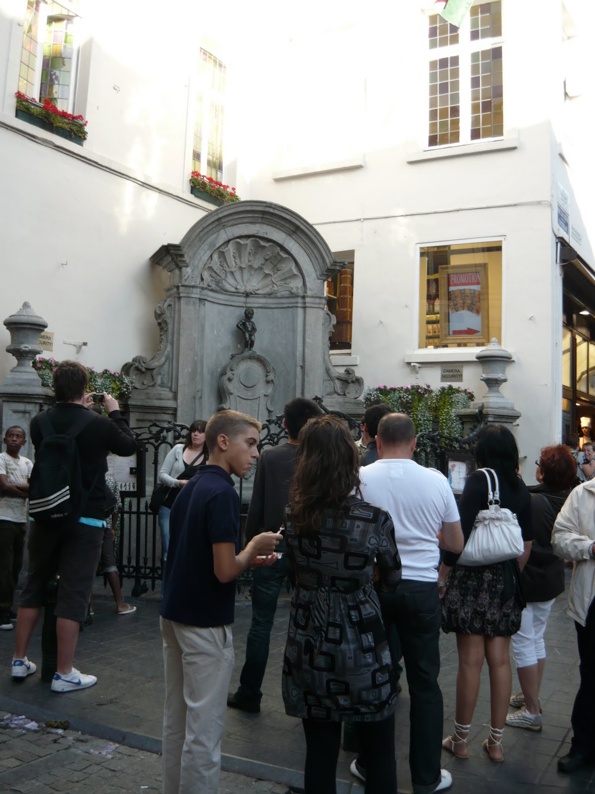
Don't let him fool you, there are a lot of tourists going there. No doubt about that.
And you wouldn't say they obsess over it:


And they have a french fries (!!?!?!) chain of restaurants with this brand (this is in Amsterdam, but they have it in Brussels too):
Maybe the best part about this is that they dress it according to the international celebrations:


The question remains.. Why?
And that's not all. Recently they made a feminine replica: Jeanneke Pis
They also have a statue of peeing dog:


And if that wouldn't be enough, it's a national sport and i can prove it.
This is one of the famous touristic points - Saint Catherine Cathedral in the center of Brussels.

Guess what are these?

They are urinals, but the unusual part is that they are on the left side of the church i shown you before. Basically on the walls of a 19th century monument.

This is how souvenirs look like:
Hey... you wouldn't say the little bastard is peeing in my coke?


And then it hit me... How else would you brand a city as THE city of beer? Simple: by having 2000 types of beer and making urinating so easy. I don't know if anyone thought of this, or it's just a natural consequence of the process. Smart, ei?
###
The initial title of the blog post was "peer (which is a combination between beer and pee) and sounds like pear", but then i changed it to what you see. Hope you don't find it offensive.
*photos taken in Brussels, august 2010

Aug 25, 2010

Christiania - the land of free (or three i?)

Believe it or not, it's real - the land of free and a place to dream for a better world, a better life and probably happiness. In the center of Copenhagen, in a huge park area (a squatted military territory) a group of hippies took over. And since 1971 the community is still living there. There were a lot of conflicts with authorities during the last 40 years, but they manage to keep the place as a heaven and a hope for those who need to believe in the idea.
This is a picture taken inside Christiania. What do you think of their life?

They have a few laws: no cars, no hard drugs, no guns, no explosives. And the hole community is: 600 adults, 200 kids, 200 cats, 200 dogs, 17 horses, and a couple of parrots.


But in this post I want to talk about their logo. This is it:

First of all I'm going to say i don't like it. And i will tell you why.
Let me start with the meaning. The 3 dots represent the 3 i's in the name Christiania. The sad part is that this is a very superficial connection, meaningless and disconnected from anything that you will find in there. For a place with so many aspirations and with so many different premises incorporated, it's hard to imagine why they chose something so unoriginal. I think they have something more to say then a plain illustration of the name (which by the way wasn't chosen by them. it was attributed to the place before).
The colors are red and yellow because they found in the ex-military space a large amount of red and yellow paint (wikipedia). I can not imagine why this colors were there, but i like the idea. Practical and symbolic.
The more i think of the design, the more intrigued i am. This community stands for so many things: freedom, hope, humanity, peace, optimism and so on. I really think they could have done better with communicating who they are. Release the freedom from the dots. It's too incarcerating and suffocating.


I think it's too naive and meaningless. But also the draw itself is too strict. Look at the logo below. Belongs to a security company. I think it's more suited for this than the free town. What do you think?

The only advantage of this design is the usability and the diversity of context you can use it and still keep the message and the connection.


Inside the "city" most of the things are branded:


So be free or be three? I choose freedom!

This picture was taken inside Christiania. And I find it so very close to freedom and happiness. I spend 1 hour jumping around. It's the most relevant thing for this place.

UPDATE: the 3 dots could also be an ellipsis (Wikipedia.org: is a mark or series of marks that usually indicate an intentional omission of a word in the original text. An ellipsis can also be used to indicate a pause in speech, an unfinished thought, or, at the end of a sentence, a trailing off into silence.) Like something left unsaid or speechless...

*photos taken in Copenhagen, Denmark - August 2010. Thanks to my good friend Carsten who took the time to take me there and jump on the happiness thing with me.

Aug 23, 2010

xxx

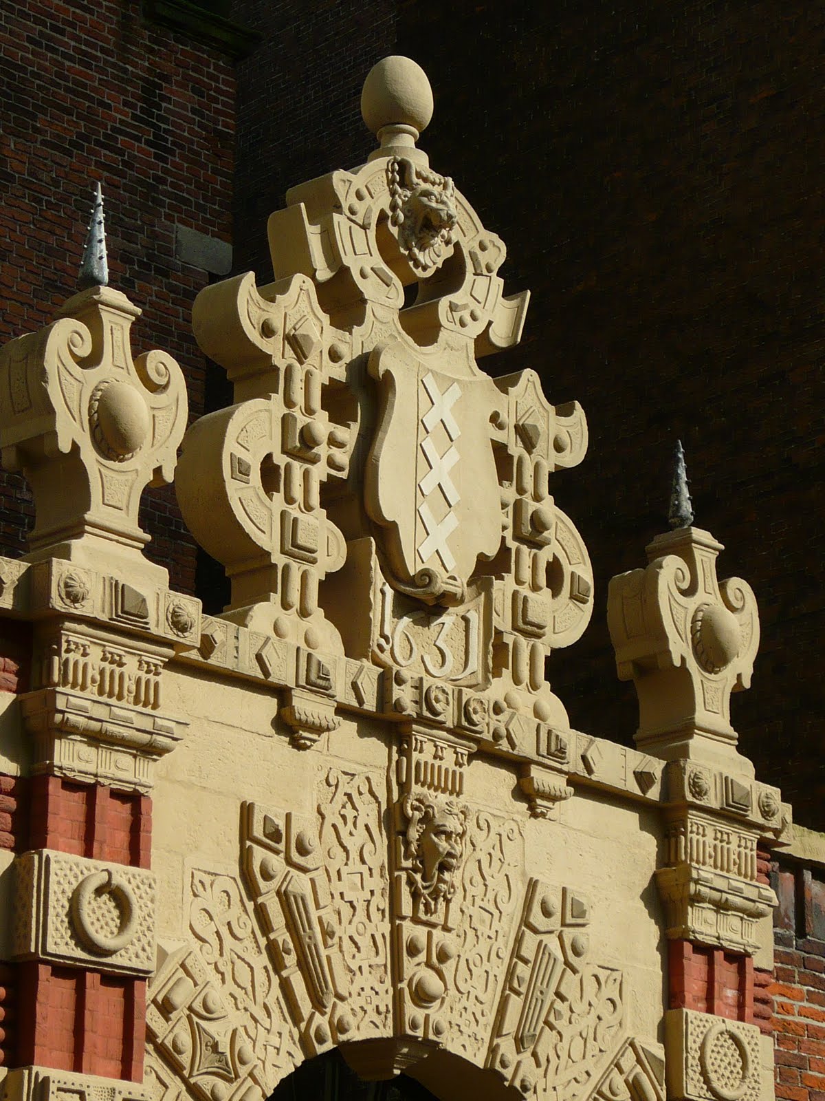
You can imagine the shock I had when I was told that this is the flag of Amsterdam.


And just like that all sort of questions came into my mind. Which was first the flag or the xxx movie rating? What does it mean? where does it come from?

My first instinct was to see the xxx symbol relating to the porno industry and also the symbol for dead cartoon characters.


Apparently the 3 Xs (the St. Andrew's cross) stand for the motto of the city: Valor, Resolution, and Mercy. A more popular version refers to the 3 threats of the city: Water, Fire and Pestilence.

The usage of the 3 xs is wide spread, from the official organization like the University to the Red Light District.


All we have to do now is wait for the .xxx domains to be approved.
By the way, do you think the rating system has anything to do with Amsterdam? Or it's just a weird coincidence?


*photo taken in Amsterdam / august 2010