Showing posts with label Sweden. Show all posts

Sep 21, 2010

Political Tea - Flower Power is back (but in other ways that you would expect it)

Because there were election in Sweden (on Sunday, 19th) i found it appropriate to write about a subject I've been meaning to write since Stockholm's Pride Parade. I won't write about politics, but i will write about the image (purely graphic) of the parties in Sweden.
This is how the general picture looks like (the 8th most important parties):
There are a lot of flowers, don't you think? Let's just take them one by one.

Moderate Party:

The logo itself expresses moderation and connection. You could even say peace, because there is always a line and a circumstance that can unify different opinion. The only problem i have with this logo is that resembles with a Metro (subway) entrance.

The Liberal Party:

Almost looks like a flower blooming, growing, expanding. And I think the colors are important here. Two shades of blue says "we can live together".


The Center Party:

The problem i have is that it's not at all centered. It's a little to the left. But it's still from floral/ vegetal inspiration.


The Christian Democrats:

Also a flower, but i don't know the background of it's meaning. Maybe it is a symbol.


The Social Democratic Party:

This and the Moderate Party are the only logos that doesn't come any close to a floral motive. But nevertheless is very expressive and memorable one. It has written social all over.
A friend of mine suggested that this is a rose. And it's normal to be, because social democrats usually have a rose for a symbol. But most of the time is a plain rose, sometimes hold in a hand. In the light of the new discovery I like it even better - it's so abstract, it's a representation of a symbol, it's more than the original. And the social component is there also. So another flower on the roll. But this time it talks.

The Green Party:

A flower, of course. And a very common one. Why do you think they chose this?


The Left Party:

V comes from "vänster" the swedish word for left. The motif is also a flower.


The Sweden Democrats:

QED


In the end it would be interesting to analyze the colors (4 blue, 2 green and 2 red) and to measure the white space in the design and also the flower shape. What exactly do they stand for. But i think you can recognize for yourself the flower type and have your own image attached to it.

What was surprising for me is this picture taken at Pride Parade in Stockholm 2010:

As you can see there are the Social Democrat, Green and Left Parties logos, only adapted to the parade. And this is when questions started to come (without knowing what they really stand for, i found out later). I think the initiative is very good, and there is one more thing that is to appreciate: they are recognizable! Which i think is a great deal.

And I will add this for the friends that will say i discriminated against the Pirate Party, but i don't think they have a voice.


The source for this article (both graphical and informational) is the official Guide to Sweden.

Aug 11, 2010

A bridge of friendship

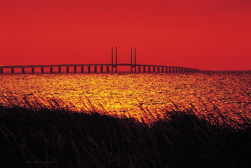
The Øresund or Öresund Bridge is the longest highway and railroad bridge in Europe (total lenght 7,845 meters). The Øresund Bridge connects Sweden and Denmark, and the The Øresund Bridge also connects two major Metropolitan Areas: those of the Danish capital city of Copenhagen and the major Swedish city of Malmö. Beyond the functional purpose, the symbolical connection is very important in the communication of the brand.
The hybrid name is Øresundsbron, a joint between Danish: Øresundsbroen and Swedish: Öresundsbron (the first letter from the Danish name and without letter "e" like in the Swedish name).

The logo is this:

Behind the stylish design, there is a meaning to this shape. The Swedish part of the Bridge is above water, and on the Danish side the road goes under, to allow ships to pass by. The shape is a symbol of it's function.

But this year is the 10th anniversary of the bridge inauguration. And it has a new logo:

From the creative agency (DDB, Copenhagen) :"For the 10 year anniversary of Øresundsbron, the bridge connecting Sweden and Denmark, an identity was needed. The bridge stands for unity and togetherness of two close, but yet, different cultures, which is something that needs to be communicated. It also stand for, individualism, variation, growth and two sides of the same coin. The identity that capsulate all of the above is a unique letter, the combination of the swedish Ö and the danish Ø, crafted into an organic and dynamic symbol that stands for the connections of two vibrant regions." I would add to this that it has the shape of the trains going on this route. They are the opposite of aerodynamic. And also this logo integrates the numbers 1 and 0 (the slash and the circle) that stand for the years of function.
There is also a down side to this design. Because of the slash you can interpret it like a interdiction (with the mention that the interdiction usually uses the slash in other direction, from left to right).

If you have the chance, take this ride. It's a 30 minutes trip above water from a world to another.


Aug 8, 2010

Because we care care care

The most important visual for this area is the Nordic Swan, the most popular logo around.


You'll see it everywhere because it applies to all Scandinavian countries and it's around since 1989.

The Nordic Ecolabel or Nordic swan is the official sustainability ecolabel for the Nordic countries. The criteria include environmental, quality and health arguments. The criteria levels promote products and services belonging to the most environmentally sound and take into account factors such as free trade and proportionality (cost vs. benefits). The Nordic Ecolabel now covers 67 different product groups, from hand soap to furniture to hotels. (Wikipedia)

The origin of the logo is in the The Nordic Council of Ministers logo, "the blue Swan" with eight wing feathers represents the five Nordic states – Denmark, Finland, Iceland, Norway and Sweden – and the three autonomous territories – Faroe Islands (Denmark), Greenland (Denmark) and Åland (Finland):

Coming back to the actual logo, i liked it from the beginning, and then i started seeing it everywhere. The world in black and white. It's like the yin-yang of the modern times. Part of green in the white and part of white in the green. But you have to make up your mind on which side do you want to be. And i was wondering if the amount of green is the same with the white. It looks like. That's a very optimistic view of the world, isn't it?


There is also an European ecolabel:
Why two labels? (Danish ecolabel website):
"The EU Flower and the Nordic Swan are not two competing brands. In fact, the two labels are two sides of same coin. But why are there two? 


The biggest difference between the Flower and the Swan is that they arise from two different departments, covering different markets. Though the goal and environmental standards are virtually identical."
So definitely for this area the Swan is more popular and more reliable, as the Scandinavians are very much interested on the origin of their products and the eco- and human- friendliness of the companies.
To be continued....

Aug 5, 2010

Stockholm, the city of crowns

This is the brand of Stockholm - The Capital of Scandinavia.

As you can see the symbol used is the crown. And apparently for good reason. The symbol of crown is very much used in all levels of design in Stockholm. There is also the 3 crowns version. Actually the 3 crown symbol (Tre Kronor) is the national symbol of Sweden. I like the theory which says that each crown represents a kingdom, but you can see more here.
Coming back to Stockholm. This is official design for the city material:


You can see the crown design in architecture and building decorations:


And other city materials:

And then you can see in the official logo of Police, Post and Transport Administration:


Trafikvert - Swedish Transport Administration. I find in this a very powerful logo design. Besides the elements integrated in the logo i see a tiger face smiling and ready to jump. Dynamic is the word you want people to think when you are a transport company.

And here am some brands that use it:

WASA - has the crown integrated in the logo design. But the actual crown is made of wheat.

Nordiska Kristall. I personally like very much this logo. Integrates the crown with the meaning of powerful cuts and also crystal working.


And products:

Performance store

A good choice of words. Performance as in performance art, as in a show. But also performance like getting impressive results on lets say sports. So the expression makes me think of ballet but also running in the park and establishing a new record for you.

Aug 4, 2010

Sunset Sea

I love this logo. It’s so simple, so unrefined, but it has a lot to say. You have the sunset (the red circle), you have the sea (the anchor) , and they are well assembled.


Seaside Söder Stockholm.