Showing posts with label EN. Show all posts

Sep 13, 2011

The colors of Paris

As all cities are, Paris in unique in many ways. One of them is the way that people use and see color here. Like in no other place, in Paris the colors are very few and very used. Let me explain this.
The city colors are made by a combination of elements:
1. first are the buildings that are creme / gray (very neutral) with black metal art work in the doors and windows, balconies and on the roofs.


2. There are the cars that are made in black and white. All the cars are either black, white or gray. They are moving very slow on the small streets of Paris. This gives to the city a note of elegance. Very rare you see a car thats green or pink or some weird color that is very acceptable here, but not on cars.

3. Another moving element are the scooters. As you probably know Paris is a city of scooters. Is the compromise of technology with the bohemian spirit around. Mostly you will see women in high hills driving around. They sometimes are a drop of color. Apparently the scoters are the sister that got to keep it's childish preferences. And the helmets are unique. This could be a trend itself.

Adding to this elements are 2 more thing that really bring color to the city.
4. First are the tree, and there are a lot of them. The tree here is plane tree (I don't have a good picture because it's autumn).
But the thing is that nature grows everywhere in Paris, on roofs, on windows, on balconies and in the most unimaginable places you can think of.


And the final straw to this is the color red that the Parisians use a lot. Because everything else is so pale.
And there is this thing about Paris, that is more vivid that any other place: "the interdiction signs". And I'm not joking. You see a lot of "ne pas stationner ici", even on buildings there are a lot of paranoiac signs like this.


For more about this, you can check my future article " The Parisians don't take no for an answer".

5. And there is another red. The red of decoration.


The perfect color of a city: black, white, gray and beige, with rich nature and drops of red. All seasoned with the joy and enthusiasm of people. After my trip to Scandinavian (where I met the coldest people), France is a good exercise. People talking to you just because they have the chance. Smiling and greeting everyone. I like this spirit.

Jan 4, 2011

Not just stars, they have crops, PhDs and gold.

When you see the flag, you see them as stars, but in reality they are very different. Like children from the same parents, they all have different personalities but they share some birthdays (like 4th of July)
In an article on 1bog.org they've done a map of what every state (in US) is good at, or what's the worst thing about it. The actual study was made for the purpose of energy efficiency rating for each state. The smiley you will see in the right upper corner refers to the energy friendly policy of that state.
The hole article is interesting because it's the first step for branding. It's the first analyze of the particularities and exception of each area.
Of course you can not brand a state in a negative top, like:
Alaska - the highest suicide rate (even though is a good market for sedatives)
Illinois as the highest gang memberships. Massachusetts as the state with the highest number of speed tickets. But you can definitely sell it as the leading energy efficient policy.
Mississippi as the #1 obesity state.
About Rhode Island I'm not sure if it's a bad thing the marijuana consumption (for branding purpose). Look at Netherlands example.


West Virginia case I guess is the most amusing - No 1 in toothlessness. And a good slogan to go with this is "don't smileeeee" - and this is how the inhabitants become the saddest people in America ;)
You have to admit this is a very peculiar market. Do you know there are some photo cameras that have a feature "smile" and they will take the picture only when the character in the frame will smile (after pressing the shutter button you can wait seconds before the camera detects the smile and takes the picture). Imagine this product don't have such a success in WV.
BUT THERE ARE SOME GOOD POINTS FOR OTHER STATES:

Wealth:
California. I'm not sure if the economy level and the UFO seeing is connected (we should definitely study the phenomena), but who wouldn't want to move to the promise land?
Or Maryland, who seems to be very "merry" on wealth:
And there are states rich in knowledge and brain:

It's good to know that there is more then fried chicken in Kentucky. Largest amount of gold ...eh? How's that for a fact?
Or the highest level of skepticism in the country. Non-religious people moved to Washington.

I guess it's better to live you to it. Imagine what you can do with this information:


Oct 21, 2010

Moscow Does Not Believe in Rebranding

I have a great passion for city branding. It's maybe the biggest realistic project for a subject like rebranding. A country is already too big to be summarized, but a city is big enough to give you the chance to come up with something memorable, but true and reality fitted.

Walking the internet I found an article in The Moscow News about Moscow's rebranding and the public talk of the proposals. First I will describe the options and then I will go personal and talk about how I saw Moscow myself.

1.

This is a very noisy logo. But I can see it fit in the Moscow reality in the next cases:
1. The contrast. I think society, people, everything there is guided by this oscillation. From very high to very low.
2. I see buildings. I also see a representation of earthquakes. The best part is that Moscow doesn't know what that means, that's why they have very tall buildings. This image is a good representation of the architecture in Moscow.
3. And then, above all, you have the red star. Nothing left to say here. Very reality like. (I'm not sure if it's very smart choice, but it's definitely a real one)
4. And of course the M from Moscow, and possible the W in the end also.
5. A reasonable use would be if you try to adapt this image to a map, to make the end of each peak a place you should go and visit.

Conclusion: this could be a representative shape for Moscow, but it's hard to see the meanings without a deeper research. Imagine this in graffiti hands.

2.
At first I thought it was a pretty simple design and totally out of context. Who can say he went to Moscow and was hugged by people on the streets? I didn't think so too. But after reading the hole proposal I could understand more of it. Besides the hug that I don't agree (but I could accept it like a wishful thinking), there are 2 other symbols integrated in it that I would like to talk about:
1. There is the round circle. And that is exactly how Moscow looks like. If Saint Petersburg is the by default the square city (all the streets are parallel and perpendicular) Moscow is the city of concentric circles. You can see it on every map, probably the circles of the city growth.
2. The second meaning I was happy to see is the hand shake. They are business people. That was my feeling all the time I was there. The cars, the streets, the attitude, everything about them was yelling - we want to make business, we want to make money. That's why I think that business tourism is more important for them than just tourism and cheeseing for pictures.
Conclusion: I don't think it's healthy to advertise a city like Moscow as friendly, because people will go there and there will be no one speaking English in the streets or at the market, nevertheless hug. But the logo has potential in all the derivation of the business growth.
Oh, and another interesting thing about this proposal was to add a "W" at the end of words and it would rime with Moscow:

3.
This is obviously M for Moscow, but that's about it. It has a lot of usage. The biggest advantage of this is that it can "grow" into almost anything. But i personally don't like it. It's not that I don't like it, it's not much to like. For me this is just a font that would go with all the branding materials.

4.

This is the sophisticated one. For me it looks like a brain. If we go down this path we might get caught in the deepness of the neurons. I think it is a representations of the city map. Maybe the correct way to say it is a brutal representation of the city, even organic. And this brings the "puzzle like" feeling about the city.

Another aspect of this design is that it's very fashionable. A topic very close to Moscow's hearth.
And I can see in the center on the draw a hand holding a hearth. I don't know if this was designed to be there, or it's just the coincidence on shapes, but it's welcomed.

5.


This could be the WWW and the McDonald's of the cities. What it actually is, that's another story. It's a Mmmmm. Do you know what that is? Neither do I, but I can guess is the process you get hungry. And it's in a shape of a smile. So smile, you're on candid camera.

6.
This logo is an invitation to talk about Moscow's problem and possible solutions. It's more an intern statement that a saleable product. I don't think that as a tourist this can speak to me.


And in the end I will write about my view of the city after a visit there. I will start by listing words that come in my mind when thinking of Moscow: round, tall, art and cultural capital, subway, deep undergrounds, fashion, expensive.
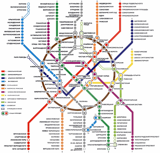
Round because all the city and then the subway is build in concentric circles.

Tall because the buildings are very tall. This is the first thing I saw when I arrived in Moscow:

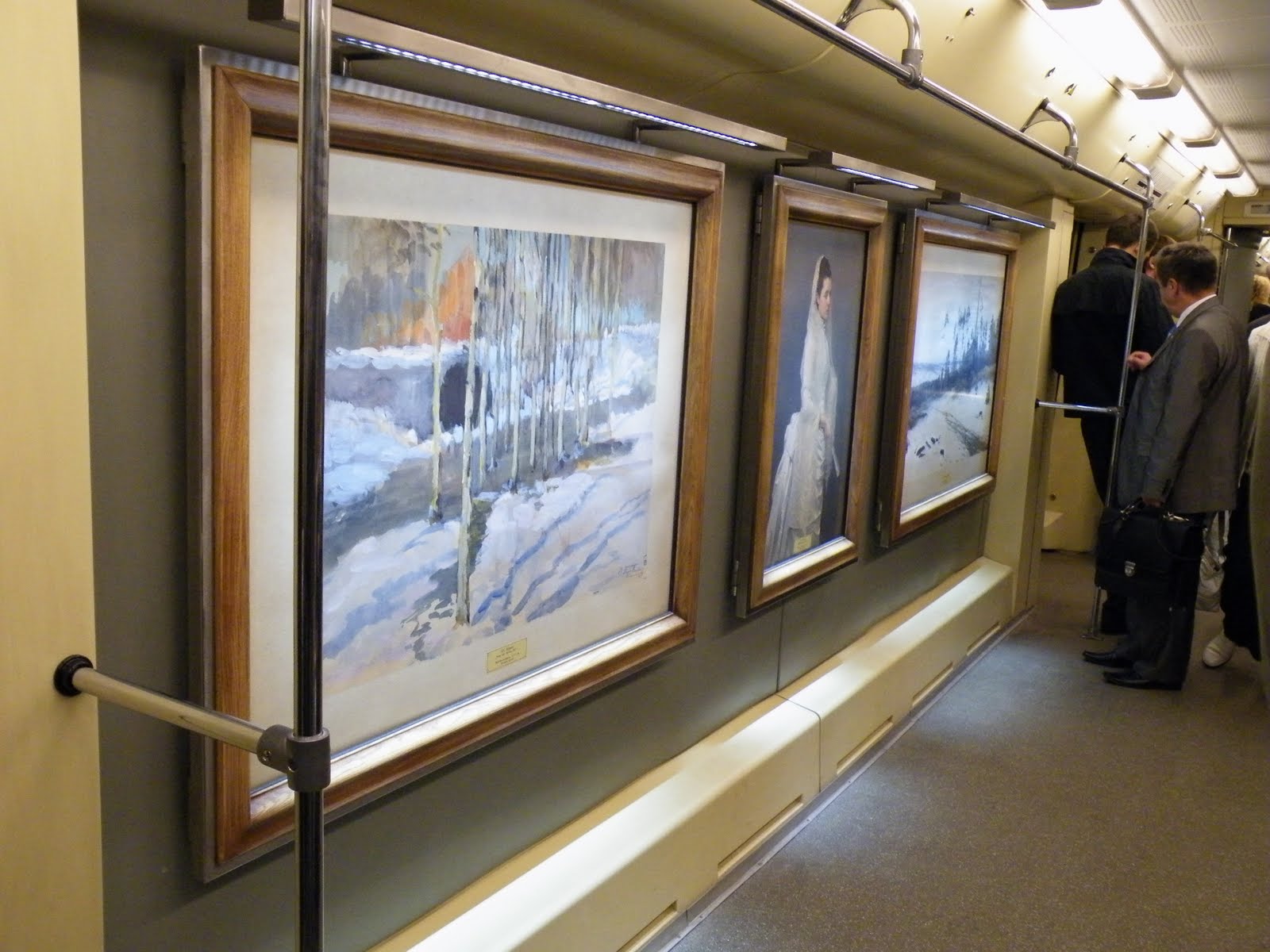
Art and cultural. I guess I don't need to explain this. It's obvious we are talking about Moscow. I'm just going to share something that impressed me. This are real paintings in a real subway in a normal day:
And the subway. It's spectacular for 2 reasons. First of all they are very deep, you go down on the stairs minutes to get to the station. And there are the stations. To describe them I would say busy museums.
To sum up all I've said, I can see Moscow in 2 different pictures. The first one resembles the first logo proposal with ups and downs only I would symbolize also the ground in the middle, i would make it less rough. The ups should be the buildings and the downs should be the deep subways. But this is purely a draw on a section. It could go as far as be the hearth beat of the city.

The second view i have over Moscow is as an "opened museum" or "outdoor museum" if you prefer.

I guess all it's left to do now is for you to go there and see for yourself. Maybe they will have soon a city-brand to attract you to go there.

Oct 13, 2010

What exactly it's really yours? You can tell me on My_____ (space), or yours.

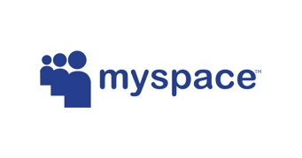
MySpace never got to me. I always found it annoying, very crowded and very untidy. Changing the logo won't do it for me. I won't start using MySpace, just like that, but I have to admit that I like the new logo.
From those 3 inexpressive people standing in line (for what?) to something so personal that you get to finish the sentence, I think it's a huge step.

It's time for you to fill out the blanks. I think this logo speaks about what social media should be all about. This comes soon after I complained about the logo design in internet (which usually sucks. no concepts, very basic and boring drawings, no integration, no meaning, nothing). This rebranding comes to tell me it's possible.

Why I like it:
1. it's mine. that makes the difference. I can do what ever I want with it. Now the "my" is much more obvious than before.
2. customizable. It's like a "do it yourself" project (DYI). Like a Lego or a modular house. With a few moves you get something very personalized. It's an invitation. A drawing space.
3. I could search my bag and see what's mine. my lighter, my books, even my life. It's all about me, isn't it?
4. gives me a sense of space, real place. Just like in this picture:
or even out of space.
5. It's one of the best instances where the logo describes what it actually means/says.
6. my place in the space. Find your place in the world.
7. my______ (write your point of view, you get your chance now)

conclusion: my life, my music, my game, my rules.

Sep 21, 2010

Political Tea - Flower Power is back (but in other ways that you would expect it)

Because there were election in Sweden (on Sunday, 19th) i found it appropriate to write about a subject I've been meaning to write since Stockholm's Pride Parade. I won't write about politics, but i will write about the image (purely graphic) of the parties in Sweden.
This is how the general picture looks like (the 8th most important parties):
There are a lot of flowers, don't you think? Let's just take them one by one.

Moderate Party:

The logo itself expresses moderation and connection. You could even say peace, because there is always a line and a circumstance that can unify different opinion. The only problem i have with this logo is that resembles with a Metro (subway) entrance.

The Liberal Party:

Almost looks like a flower blooming, growing, expanding. And I think the colors are important here. Two shades of blue says "we can live together".

The Center Party:

The problem i have is that it's not at all centered. It's a little to the left. But it's still from floral/ vegetal inspiration.


The Christian Democrats:

Also a flower, but i don't know the background of it's meaning. Maybe it is a symbol.


The Social Democratic Party:

This and the Moderate Party are the only logos that doesn't come any close to a floral motive. But nevertheless is very expressive and memorable one. It has written social all over.
A friend of mine suggested that this is a rose. And it's normal to be, because social democrats usually have a rose for a symbol. But most of the time is a plain rose, sometimes hold in a hand. In the light of the new discovery I like it even better - it's so abstract, it's a representation of a symbol, it's more than the original. And the social component is there also. So another flower on the roll. But this time it talks.

The Green Party:

A flower, of course. And a very common one. Why do you think they chose this?


The Left Party:

V comes from "vänster" the swedish word for left. The motif is also a flower.


The Sweden Democrats:

QED


In the end it would be interesting to analyze the colors (4 blue, 2 green and 2 red) and to measure the white space in the design and also the flower shape. What exactly do they stand for. But i think you can recognize for yourself the flower type and have your own image attached to it.

What was surprising for me is this picture taken at Pride Parade in Stockholm 2010:

As you can see there are the Social Democrat, Green and Left Parties logos, only adapted to the parade. And this is when questions started to come (without knowing what they really stand for, i found out later). I think the initiative is very good, and there is one more thing that is to appreciate: they are recognizable! Which i think is a great deal.

And I will add this for the friends that will say i discriminated against the Pirate Party, but i don't think they have a voice.


The source for this article (both graphical and informational) is the official Guide to Sweden.

Sep 12, 2010

growing human (best logo in Amsterdam)

I declare this the best logo in Amsterdam (Tropentheatre in Amsterdam):


It's amazing. I could get lost just watching this logo and thinking about all the meaning.

from their website: "The Tropentheater is the best place for concerts, dance performances, theater, youth theater and films from non-Western countries and the fringes of Europe."
The name translates as the Tropics Theater. Obviously the name it's the statement regarding the content of the performances they have in their program (non-western, but i would say even non-european).

If you look at the logo, you will see human shapes, as captured from their movement and performance. It could be dance, theater or film. Or even lecture (look at the to shapes standing in the bottom). And together they form a tree, a human tree. Or even better, they are united in a tree, in a common ground, in a growing environment. It's about expression and unity in the same time.
It also gives me the impression of floating or flying. Of relaxation, freedom and self expression. It's also about growing, growing like artists, like humans, like a planet.

And then we can talk about derivations:


Using the same pattern, the same concept of connectivity you can keep on adding to the design.
Hope you like it.

*photos taken in Amsterdam, august 2010