*photo taken in Amsterdam / august 2010
Aug 20, 2010
King of the road
*photo taken in Amsterdam / august 2010
Coke and Fanta ... together?
the best in Hamburg
The first thing that comes into my mind when i see it is that "light can be controlled". We can make it the way we wanted it to be. And that's good for someone selling light design.* photo taken in Hamburg / august 2010
Just relax
* photo taken in Hamburg / august 2010
Express yourself
Aug 11, 2010
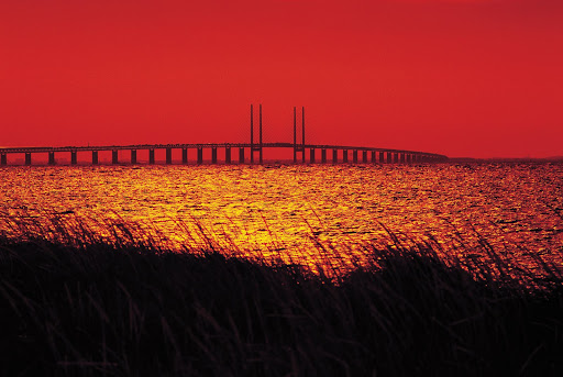
A bridge of friendship
The hybrid name is Øresundsbron, a joint between Danish: Øresundsbroen and Swedish: Öresundsbron (the first letter from the Danish name and without letter "e" like in the Swedish name).
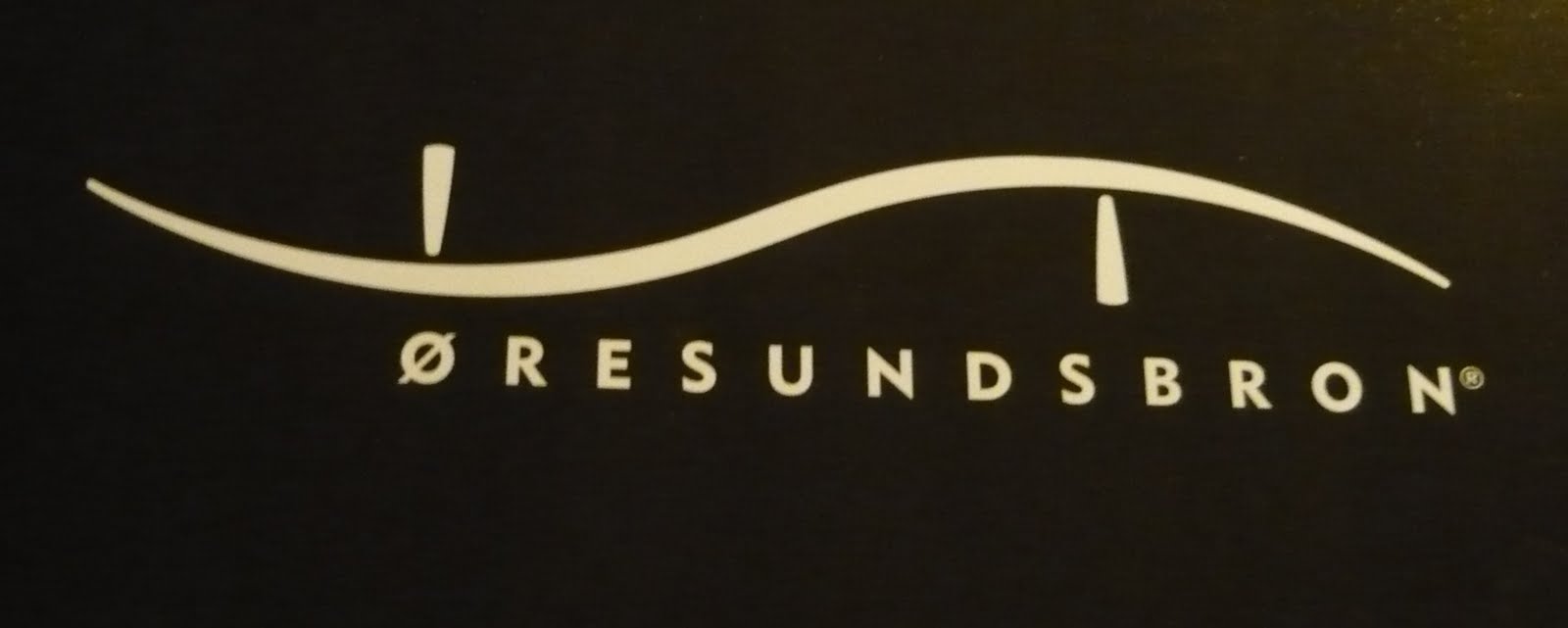
The logo is this:
Behind the stylish design, there is a meaning to this shape. The Swedish part of the Bridge is above water, and on the Danish side the road goes under, to allow ships to pass by. The shape is a symbol of it's function.But this year is the 10th anniversary of the bridge inauguration. And it has a new logo:
From the creative agency (DDB, Copenhagen) :"For the 10 year anniversary of Øresundsbron, the bridge connecting Sweden and Denmark, an identity was needed. The bridge stands for unity and togetherness of two close, but yet, different cultures, which is something that needs to be communicated. It also stand for, individualism, variation, growth and two sides of the same coin. The identity that capsulate all of the above is a unique letter, the combination of the swedish Ö and the danish Ø, crafted into an organic and dynamic symbol that stands for the connections of two vibrant regions." I would add to this that it has the shape of the trains going on this route. They are the opposite of aerodynamic. And also this logo integrates the numbers 1 and 0 (the slash and the circle) that stand for the years of function.There is also a down side to this design. Because of the slash you can interpret it like a interdiction (with the mention that the interdiction usually uses the slash in other direction, from left to right).
If you have the chance, take this ride. It's a 30 minutes trip above water from a world to another.

Openness

And to show the dedication to the meaning of open, they opened the logo itself. You can make your own version. Just go here.


Da Vinci

Aug 8, 2010
The best logo in Oslo.
1. The shopping center Oslo City . I wrote about it here.
2. Solheim + Jacobsen. It's an architecture studio. Check out the logo. It looks like a Square building with a corridor inside (architecture like motive). But it's also the first letter of each name. You can see the S and the J with gray on white background.
4. Restaurant. For me what they did to the Post is amazing. So it's definitely the winner of this. What do you think?
Because we care care care
You'll see it everywhere because it applies to all Scandinavian countries and it's around since 1989.
The Nordic Ecolabel or Nordic swan is the official sustainability ecolabel for the Nordic countries. The criteria include environmental, quality and health arguments. The criteria levels promote products and services belonging to the most environmentally sound and take into account factors such as free trade and proportionality (cost vs. benefits). The Nordic Ecolabel now covers 67 different product groups, from hand soap to furniture to hotels. (Wikipedia)
The origin of the logo is in the The Nordic Council of Ministers logo, "the blue Swan" with eight wing feathers represents the five Nordic states – Denmark, Finland, Iceland, Norway and Sweden – and the three autonomous territories – Faroe Islands (Denmark), Greenland (Denmark) and Åland (Finland):
Coming back to the actual logo, i liked it from the beginning, and then i started seeing it everywhere. The world in black and white. It's like the yin-yang of the modern times. Part of green in the white and part of white in the green. But you have to make up your mind on which side do you want to be. And i was wondering if the amount of green is the same with the white. It looks like. That's a very optimistic view of the world, isn't it?
There is also an European ecolabel:
"The EU Flower and the Nordic Swan are not two competing brands. In fact, the two labels are two sides of same coin. But why are there two?
The biggest difference between the Flower and the Swan is that they arise from two different departments, covering different markets. Though the goal and environmental standards are virtually identical."
So definitely for this area the Swan is more popular and more reliable, as the Scandinavians are very much interested on the origin of their products and the eco- and human- friendliness of the companies.
To be continued....
Restaurant
I liked this graphic from the first time i saw it. I can not tell why. There is no big connection between the name and the expression. EIK in Norwegian means OAK.
But the simplicity and the implementation is impeccable. Not even on the website of the studio that design it I couldn't find anything for the meaning of the symbol. But i can agree with them on this "a profile with a somewhat of an abstract element which could easily be implemented in everything from signing to plates and decoration. "

Flower talk
I like it because it has so many meaning attached to it.
First of all the flowers are not the center of attention. But the person offering them and the circumstances. It’s a man running. He is either running because he wants to get there faster to say what he has to say, or because he’s the delivery guy and they are fast as a train company (check out the foot and head wear symbols).
And the name… well not sure if they intended it, but interflowers means between flowers. I feel like it's a hidden compliment in there. What do you think?
City in a city
What is Oslo City? It’s a shopping center. That’s it. As simple as that. What’s amazing about it? First of all the communication as a city. I’ve been there and it is surprisingly big and it has something that reminds me of a city, more like a citadel.The second thing is how they managed to express this idea of a city. More exactly a city in a city. If you watch the logo carefully you will see the letter C from the word CITY integrates the letter O, the second O from OSLO. To get the picture you can think of it as Vatican.
Aug 7, 2010
New Post
So you can see the horn (in red), you can see the twist (the circle int he the middle), and it's still so simple.

There are actually 2 companies. The first is the actual Post Office and the second one is the transportation part of the business. You can see how they integrated the 2 directions into the meaning.
Aug 5, 2010
this logo won't bite you