Showing posts with label logo. Show all posts

Jan 28, 2011

Vodafonge vs Orangeone

Orange este dreptunghiul, culoarea, fontul si textul.
Vodafone este cercul, codita (doar cea din stanga), centrul gol si pozitionarea
Si mai este si o portocala la mijloc.
Asta este ceea ce numesc eu amuzant. Demonstratia ca diferentele intre ceea ce consideram noi unic sunt doar o aparenta, barierele si granitele sunt doar in asocierile pe care le facem noi.

Dec 8, 2010

Alexandra Stan forward

Unul dintre putinii artisti la care am vazut o forma de branding vizual. Motivul ales este unul deja exploatat la maxim, dar eu zic ca se se potriveste, are o memorabilitate aparte si este adaptat excelent contextului numelui. Intr-un fel imi aduce aminte de FedEx, doar ca acolo era o sageata foarte bine ascunsa in font si avea cu totul alta semnificatie. In cazul de fata nu este doar un buton de play, este un buton de forward.
Sunt si cateva aspecte discordante ale desineului iar propunerea vizuala de mai sus in nici un caz nu este folosita nici pe site si nici la alte materiale la potentialul pe care il are.

Insa acum vreau sa vorbesc de perceptia numelui de STAN. Prin asociere cu "stand" numele artistei poate induce o nota statica, diametral opus fata de dinamismul muzicii si a propunerii de logo. Bineinteles ca nu vorbim de un proces de naming (in afara de ala de la botez), insa acest apect al perceptie trebuie luat in considerare.


Oct 13, 2010

What exactly it's really yours? You can tell me on My_____ (space), or yours.

MySpace never got to me. I always found it annoying, very crowded and very untidy. Changing the logo won't do it for me. I won't start using MySpace, just like that, but I have to admit that I like the new logo.
From those 3 inexpressive people standing in line (for what?) to something so personal that you get to finish the sentence, I think it's a huge step.

It's time for you to fill out the blanks. I think this logo speaks about what social media should be all about. This comes soon after I complained about the logo design in internet (which usually sucks. no concepts, very basic and boring drawings, no integration, no meaning, nothing). This rebranding comes to tell me it's possible.

Why I like it:
1. it's mine. that makes the difference. I can do what ever I want with it. Now the "my" is much more obvious than before.
2. customizable. It's like a "do it yourself" project (DYI). Like a Lego or a modular house. With a few moves you get something very personalized. It's an invitation. A drawing space.
3. I could search my bag and see what's mine. my lighter, my books, even my life. It's all about me, isn't it?
4. gives me a sense of space, real place. Just like in this picture:
or even out of space.
5. It's one of the best instances where the logo describes what it actually means/says.
6. my place in the space. Find your place in the world.
7. my______ (write your point of view, you get your chance now)

conclusion: my life, my music, my game, my rules.

Oct 3, 2010

Milionarul Mioritic - pe-o gura de rai

Bantuind pe net am dat de un site foarte interesant. Siteul se numeste Milionarul Mioritic si are urmatorul logo:
Foarte spiritual logoul. Cum transhumanta ne este in sange, de ce sa nu ne fie si in finante. Ideea mi s-a parut geniala, insa as avea cateva aprecieri negative (din pacate). Oricum valoarea lui este inestimabila pentru popor. Sa purcedem deci:
1. dolarul nu mai este la moda. Inteleg alegerea pentru ca trebuia sa se sprijine intr-un bat si nu se putea propti in €. Desi putea sa faca un euro imbracat in oaie...
2. grosimea liniei folosite la dolar cu cea cu care este construit omul sunt foarte diferite si provoaca o ruptura
3. contextul in care este folosit iarasi este fragmentar. Fontul ales nu se potriveste deloc cu simbolul.
4. nu am gasit pe site nici un alt material derivat din acest concept. As fi vrut sa gasesc contul de twitter mai cret decat de obicei, sau orice alta asociere cu tema data. Pacat de potentialul pe care il are conceptul.
Oricum felicitari pentru idee si pana una alta mai faceti si voi o finanta personala.

Sep 21, 2010

Political Tea - Flower Power is back (but in other ways that you would expect it)

Because there were election in Sweden (on Sunday, 19th) i found it appropriate to write about a subject I've been meaning to write since Stockholm's Pride Parade. I won't write about politics, but i will write about the image (purely graphic) of the parties in Sweden.
This is how the general picture looks like (the 8th most important parties):
There are a lot of flowers, don't you think? Let's just take them one by one.

Moderate Party:

The logo itself expresses moderation and connection. You could even say peace, because there is always a line and a circumstance that can unify different opinion. The only problem i have with this logo is that resembles with a Metro (subway) entrance.

The Liberal Party:

Almost looks like a flower blooming, growing, expanding. And I think the colors are important here. Two shades of blue says "we can live together".


The Center Party:

The problem i have is that it's not at all centered. It's a little to the left. But it's still from floral/ vegetal inspiration.


The Christian Democrats:

Also a flower, but i don't know the background of it's meaning. Maybe it is a symbol.


The Social Democratic Party:

This and the Moderate Party are the only logos that doesn't come any close to a floral motive. But nevertheless is very expressive and memorable one. It has written social all over.
A friend of mine suggested that this is a rose. And it's normal to be, because social democrats usually have a rose for a symbol. But most of the time is a plain rose, sometimes hold in a hand. In the light of the new discovery I like it even better - it's so abstract, it's a representation of a symbol, it's more than the original. And the social component is there also. So another flower on the roll. But this time it talks.

The Green Party:

A flower, of course. And a very common one. Why do you think they chose this?


The Left Party:

V comes from "vänster" the swedish word for left. The motif is also a flower.


The Sweden Democrats:

QED


In the end it would be interesting to analyze the colors (4 blue, 2 green and 2 red) and to measure the white space in the design and also the flower shape. What exactly do they stand for. But i think you can recognize for yourself the flower type and have your own image attached to it.

What was surprising for me is this picture taken at Pride Parade in Stockholm 2010:

As you can see there are the Social Democrat, Green and Left Parties logos, only adapted to the parade. And this is when questions started to come (without knowing what they really stand for, i found out later). I think the initiative is very good, and there is one more thing that is to appreciate: they are recognizable! Which i think is a great deal.

And I will add this for the friends that will say i discriminated against the Pirate Party, but i don't think they have a voice.


The source for this article (both graphical and informational) is the official Guide to Sweden.

Sep 12, 2010

growing human (best logo in Amsterdam)

I declare this the best logo in Amsterdam (Tropentheatre in Amsterdam):


It's amazing. I could get lost just watching this logo and thinking about all the meaning.

from their website: "The Tropentheater is the best place for concerts, dance performances, theater, youth theater and films from non-Western countries and the fringes of Europe."
The name translates as the Tropics Theater. Obviously the name it's the statement regarding the content of the performances they have in their program (non-western, but i would say even non-european).

If you look at the logo, you will see human shapes, as captured from their movement and performance. It could be dance, theater or film. Or even lecture (look at the to shapes standing in the bottom). And together they form a tree, a human tree. Or even better, they are united in a tree, in a common ground, in a growing environment. It's about expression and unity in the same time.
It also gives me the impression of floating or flying. Of relaxation, freedom and self expression. It's also about growing, growing like artists, like humans, like a planet.

And then we can talk about derivations:


Using the same pattern, the same concept of connectivity you can keep on adding to the design.
Hope you like it.

*photos taken in Amsterdam, august 2010

Aug 20, 2010

the best in Hamburg

I will name this the best for Hamburg.

The first thing that comes into my mind when i see it is that "light can be controlled". We can make it the way we wanted it to be. And that's good for someone selling light design.


* photo taken in Hamburg / august 2010

Just relax

You don't get it more expressive then this. It's the perfect invitation. If you look closely, you'll see the "l" and the "b".

* photo taken in Hamburg / august 2010

Aug 8, 2010

The best logo in Oslo.

I want to do this for every city I go. So lets see the candidates:
1. The shopping center Oslo City . I wrote about it here.

2. Solheim + Jacobsen. It's an architecture studio. Check out the logo. It looks like a Square building with a corridor inside (architecture like motive). But it's also the first letter of each name. You can see the S and the J with gray on white background.
3. The Post. I wrote about it here.
4. Restaurant.

For me what they did to the Post is amazing. So it's definitely the winner of this. What do you think?

Because we care care care

The most important visual for this area is the Nordic Swan, the most popular logo around.


You'll see it everywhere because it applies to all Scandinavian countries and it's around since 1989.

The Nordic Ecolabel or Nordic swan is the official sustainability ecolabel for the Nordic countries. The criteria include environmental, quality and health arguments. The criteria levels promote products and services belonging to the most environmentally sound and take into account factors such as free trade and proportionality (cost vs. benefits). The Nordic Ecolabel now covers 67 different product groups, from hand soap to furniture to hotels. (Wikipedia)

The origin of the logo is in the The Nordic Council of Ministers logo, "the blue Swan" with eight wing feathers represents the five Nordic states – Denmark, Finland, Iceland, Norway and Sweden – and the three autonomous territories – Faroe Islands (Denmark), Greenland (Denmark) and Ă…land (Finland):

Coming back to the actual logo, i liked it from the beginning, and then i started seeing it everywhere. The world in black and white. It's like the yin-yang of the modern times. Part of green in the white and part of white in the green. But you have to make up your mind on which side do you want to be. And i was wondering if the amount of green is the same with the white. It looks like. That's a very optimistic view of the world, isn't it?


There is also an European ecolabel:
Why two labels? (Danish ecolabel website):
"The EU Flower and the Nordic Swan are not two competing brands. In fact, the two labels are two sides of same coin. But why are there two? 


The biggest difference between the Flower and the Swan is that they arise from two different departments, covering different markets. Though the goal and environmental standards are virtually identical."
So definitely for this area the Swan is more popular and more reliable, as the Scandinavians are very much interested on the origin of their products and the eco- and human- friendliness of the companies.
To be continued....

Aug 7, 2010

New Post

The name is not a mistake. It's about a new and lovely Post logo. A re branding that took place 3 years ago. All the Post logos are the traditional twisted horn with added symbols of the country or some local info, but they generally follow the same recipe. I saw it all over, in different versions and different interpretations. This is a brand new logo that still has the symbol in it, but the design is contemporary.
So you can see the horn (in red), you can see the twist (the circle int he the middle), and it's still so simple.


There are actually 2 companies. The first is the actual Post Office and the second one is the transportation part of the business. You can see how they integrated the 2 directions into the meaning.
I simply love this. I find it smart, clean and powerful.

Aug 5, 2010

The best logo in Stockholm

We have 2 winners:
One is for best word play, and second is for the design and symbol. I didn’t found a logo that is outstanding and has a good, clear and innovative communication.

The brand that made me smile is Stockhome. It’s so inspired and catchy. “Making Stockholm your home” – just great (this is not their official slogan, it's just my interpretation of the meaning). But it has no graphic representation other then their choice of font and dimension.
Here goes:


The best symbol:
I love the design of this. It’s a symbol for renting bicycles. I love the lines, the light and the power of expression.


And here is the actually rent place. You have a card and you just get a bike.

Stockholm, the city of crowns

This is the brand of Stockholm - The Capital of Scandinavia.

As you can see the symbol used is the crown. And apparently for good reason. The symbol of crown is very much used in all levels of design in Stockholm. There is also the 3 crowns version. Actually the 3 crown symbol (Tre Kronor) is the national symbol of Sweden. I like the theory which says that each crown represents a kingdom, but you can see more here.
Coming back to Stockholm. This is official design for the city material:


You can see the crown design in architecture and building decorations:


And other city materials:

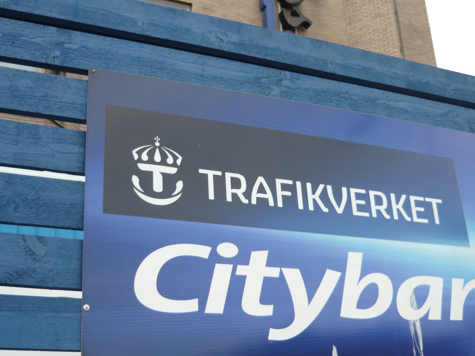
And then you can see in the official logo of Police, Post and Transport Administration:


Trafikvert - Swedish Transport Administration. I find in this a very powerful logo design. Besides the elements integrated in the logo i see a tiger face smiling and ready to jump. Dynamic is the word you want people to think when you are a transport company.

And here am some brands that use it:

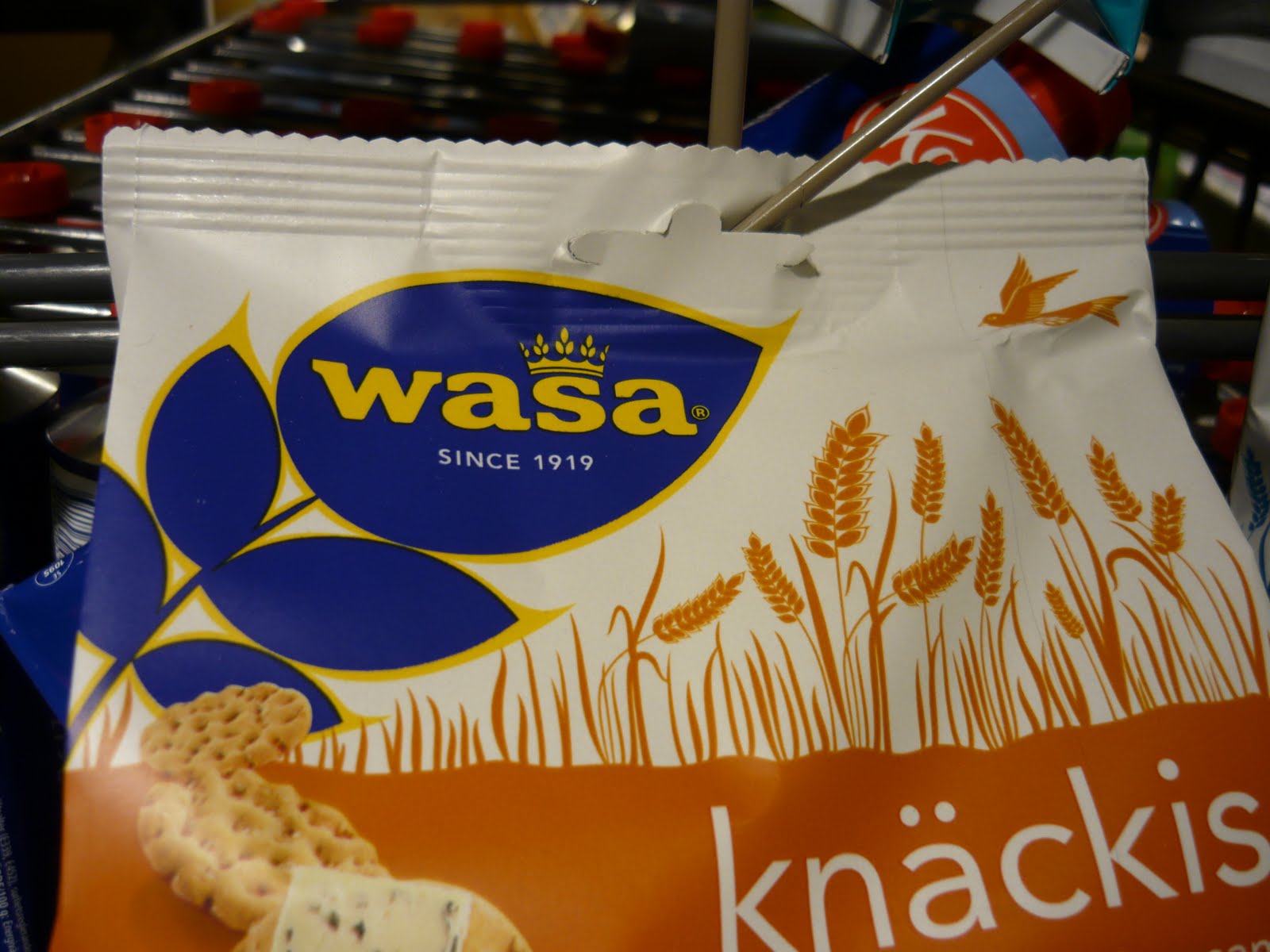
WASA - has the crown integrated in the logo design. But the actual crown is made of wheat.

Nordiska Kristall. I personally like very much this logo. Integrates the crown with the meaning of powerful cuts and also crystal working.


And products: