 Ce inseamna sa iti doresti cand esti mic sa te faci politist? A expirat visul asta. In ziua de azi trebuie sa faci dubla investigare.
Nov 30, 2010
Ai I sau n-ai I
Pentru cei care nu stiu cu cati de "i" se scrie copii, punem la dispozitie un nou set de teste. Sa decline substantivul FBI. A se citi "ef bi ai ai"
 Ce inseamna sa iti doresti cand esti mic sa te faci politist? A expirat visul asta. In ziua de azi trebuie sa faci dubla investigare.
Ce inseamna sa iti doresti cand esti mic sa te faci politist? A expirat visul asta. In ziua de azi trebuie sa faci dubla investigare.

Oct 31, 2010
Come back for coffee
Coffee Back este o cafenea in Brasov. Un nume foarte inspirat, o invitatie la o cafea si la o reintoarcere.
 Daca va uitati atent, cei 2 F, pozitionati cu fata unul catre celalalt pot fi cititi ca un M, si atunci toata fraza are alt sens - COME BACK.
 Asa ca nu-mi ramane decat sa va dedic o melodie:
 Daca va uitati atent, cei 2 F, pozitionati cu fata unul catre celalalt pot fi cititi ca un M, si atunci toata fraza are alt sens - COME BACK.
 Asa ca nu-mi ramane decat sa va dedic o melodie:
Oct 21, 2010
Moscow Does Not Believe in Rebranding
I have a great passion for city branding. It's maybe the biggest realistic project for a subject like rebranding. A country is already too big to be summarized, but a city is big enough to give you the chance to come up with something memorable, but true and reality fitted.
Walking the internet I found an article in The Moscow News about Moscow's rebranding and the public talk of the proposals. First I will describe the options and then I will go personal and talk about how I saw Moscow myself.
1.

This is a very noisy logo. But I can see it fit in the Moscow reality in the next cases:
1. The contrast. I think society, people, everything there is guided by this oscillation. From very high to very low.
2. I see buildings. I also see a representation of earthquakes. The best part is that Moscow doesn't know what that means, that's why they have very tall buildings. This image is a good representation of the architecture in Moscow.
3. And then, above all, you have the red star. Nothing left to say here. Very reality like. (I'm not sure if it's very smart choice, but it's definitely a real one)
4. And of course the M from Moscow, and possible the W in the end also.
5. A reasonable use would be if you try to adapt this image to a map, to make the end of each peak a place you should go and visit.
Conclusion: this could be a representative shape for Moscow, but it's hard to see the meanings without a deeper research. Imagine this in graffiti hands.
2.
 At first I thought it was a pretty simple design and totally out of context. Who can say he went to Moscow and was hugged by people on the streets? I didn't think so too. But after reading the hole proposal I could understand more of it. Besides the hug that I don't agree (but I could accept it like a wishful thinking), there are 2 other symbols integrated in it that I would like to talk about:
1. There is the round circle. And that is exactly how Moscow looks like. If Saint Petersburg is the by default the square city (all the streets are parallel and perpendicular) Moscow is the city of concentric circles. You can see it on every map, probably the circles of the city growth.
2. The second meaning I was happy to see is the hand shake. They are business people. That was my feeling all the time I was there. The cars, the streets, the attitude, everything about them was yelling - we want to make business, we want to make money. That's why I think that business tourism is more important for them than just tourism and cheeseing for pictures.
Conclusion: I don't think it's healthy to advertise a city like Moscow as friendly, because people will go there and there will be no one speaking English in the streets or at the market, nevertheless hug. But the logo has potential in all the derivation of the business growth.
Oh, and another interesting thing about this proposal was to add a "W" at the end of words and it would rime with Moscow:

3.
 This is obviously M for Moscow, but that's about it. It has a lot of usage. The biggest advantage of this is that it can "grow" into almost anything. But i personally don't like it. It's not that I don't like it, it's not much to like. For me this is just a font that would go with all the branding materials.
4.

This is the sophisticated one. For me it looks like a brain. If we go down this path we might get caught in the deepness of the neurons. I think it is a representations of the city map. Maybe the correct way to say it is a brutal representation of the city, even organic. And this brings the "puzzle like" feeling about the city.
Another aspect of this design is that it's very fashionable. A topic very close to Moscow's hearth.
And I can see in the center on the draw a hand holding a hearth. I don't know if this was designed to be there, or it's just the coincidence on shapes, but it's welcomed.
5.

This could be the WWW and the McDonald's of the cities. What it actually is, that's another story. It's a Mmmmm. Do you know what that is? Neither do I, but I can guess is the process you get hungry. And it's in a shape of a smile. So smile, you're on candid camera.
6.
 This logo is an invitation to talk about Moscow's problem and possible solutions. It's more an intern statement that a saleable product. I don't think that as a tourist this can speak to me.
And in the end I will write about my view of the city after a visit there. I will start by listing words that come in my mind when thinking of Moscow: round, tall, art and cultural capital, subway, deep undergrounds, fashion, expensive.
Round because all the city and then the subway is build in concentric circles.
 Tall because the buildings are very tall. This is the first thing I saw when I arrived in Moscow:

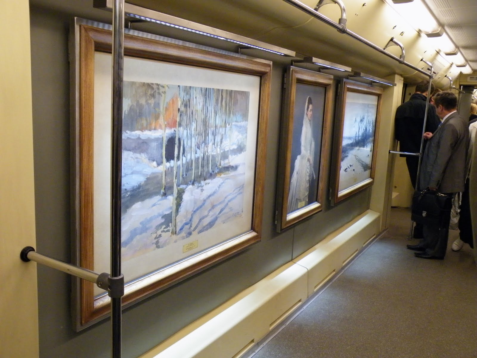
Art and cultural. I guess I don't need to explain this. It's obvious we are talking about Moscow. I'm just going to share something that impressed me. This are real paintings in a real subway in a normal day:
 And the subway. It's spectacular for 2 reasons. First of all they are very deep, you go down on the stairs minutes to get to the station. And there are the stations. To describe them I would say busy museums.
 To sum up all I've said, I can see Moscow in 2 different pictures. The first one resembles the first logo proposal with ups and downs only I would symbolize also the ground in the middle, i would make it less rough. The ups should be the buildings and the downs should be the deep subways. But this is purely a draw on a section. It could go as far as be the hearth beat of the city.
The second view i have over Moscow is as an "opened museum" or "outdoor museum" if you prefer.
I guess all it's left to do now is for you to go there and see for yourself. Maybe they will have soon a city-brand to attract you to go there.
Walking the internet I found an article in The Moscow News about Moscow's rebranding and the public talk of the proposals. First I will describe the options and then I will go personal and talk about how I saw Moscow myself.
1.

This is a very noisy logo. But I can see it fit in the Moscow reality in the next cases:
1. The contrast. I think society, people, everything there is guided by this oscillation. From very high to very low.
2. I see buildings. I also see a representation of earthquakes. The best part is that Moscow doesn't know what that means, that's why they have very tall buildings. This image is a good representation of the architecture in Moscow.
3. And then, above all, you have the red star. Nothing left to say here. Very reality like. (I'm not sure if it's very smart choice, but it's definitely a real one)
4. And of course the M from Moscow, and possible the W in the end also.
5. A reasonable use would be if you try to adapt this image to a map, to make the end of each peak a place you should go and visit.
Conclusion: this could be a representative shape for Moscow, but it's hard to see the meanings without a deeper research. Imagine this in graffiti hands.
2.
 At first I thought it was a pretty simple design and totally out of context. Who can say he went to Moscow and was hugged by people on the streets? I didn't think so too. But after reading the hole proposal I could understand more of it. Besides the hug that I don't agree (but I could accept it like a wishful thinking), there are 2 other symbols integrated in it that I would like to talk about:
1. There is the round circle. And that is exactly how Moscow looks like. If Saint Petersburg is the by default the square city (all the streets are parallel and perpendicular) Moscow is the city of concentric circles. You can see it on every map, probably the circles of the city growth.
2. The second meaning I was happy to see is the hand shake. They are business people. That was my feeling all the time I was there. The cars, the streets, the attitude, everything about them was yelling - we want to make business, we want to make money. That's why I think that business tourism is more important for them than just tourism and cheeseing for pictures.
Conclusion: I don't think it's healthy to advertise a city like Moscow as friendly, because people will go there and there will be no one speaking English in the streets or at the market, nevertheless hug. But the logo has potential in all the derivation of the business growth.
Oh, and another interesting thing about this proposal was to add a "W" at the end of words and it would rime with Moscow:

3.
 This is obviously M for Moscow, but that's about it. It has a lot of usage. The biggest advantage of this is that it can "grow" into almost anything. But i personally don't like it. It's not that I don't like it, it's not much to like. For me this is just a font that would go with all the branding materials.
4.

This is the sophisticated one. For me it looks like a brain. If we go down this path we might get caught in the deepness of the neurons. I think it is a representations of the city map. Maybe the correct way to say it is a brutal representation of the city, even organic. And this brings the "puzzle like" feeling about the city.
Another aspect of this design is that it's very fashionable. A topic very close to Moscow's hearth.
And I can see in the center on the draw a hand holding a hearth. I don't know if this was designed to be there, or it's just the coincidence on shapes, but it's welcomed.
5.

This could be the WWW and the McDonald's of the cities. What it actually is, that's another story. It's a Mmmmm. Do you know what that is? Neither do I, but I can guess is the process you get hungry. And it's in a shape of a smile. So smile, you're on candid camera.
6.
 This logo is an invitation to talk about Moscow's problem and possible solutions. It's more an intern statement that a saleable product. I don't think that as a tourist this can speak to me.
And in the end I will write about my view of the city after a visit there. I will start by listing words that come in my mind when thinking of Moscow: round, tall, art and cultural capital, subway, deep undergrounds, fashion, expensive.
Round because all the city and then the subway is build in concentric circles.
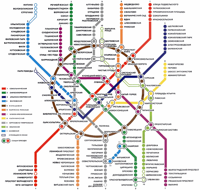 Tall because the buildings are very tall. This is the first thing I saw when I arrived in Moscow:
Art and cultural. I guess I don't need to explain this. It's obvious we are talking about Moscow. I'm just going to share something that impressed me. This are real paintings in a real subway in a normal day:
 And the subway. It's spectacular for 2 reasons. First of all they are very deep, you go down on the stairs minutes to get to the station. And there are the stations. To describe them I would say busy museums.
 To sum up all I've said, I can see Moscow in 2 different pictures. The first one resembles the first logo proposal with ups and downs only I would symbolize also the ground in the middle, i would make it less rough. The ups should be the buildings and the downs should be the deep subways. But this is purely a draw on a section. It could go as far as be the hearth beat of the city.
The second view i have over Moscow is as an "opened museum" or "outdoor museum" if you prefer.
I guess all it's left to do now is for you to go there and see for yourself. Maybe they will have soon a city-brand to attract you to go there.
Oct 13, 2010
What exactly it's really yours? You can tell me on My_____ (space), or yours.
MySpace never got to me. I always found it annoying, very crowded and very untidy. Changing the logo won't do it for me. I won't start using MySpace, just like that, but I have to admit that I like the new logo.
From those 3 inexpressive people standing in line (for what?) to something so personal that you get to finish the sentence, I think it's a huge step.

 It's time for you to fill out the blanks. I think this logo speaks about what social media should be all about. This comes soon after I complained about the logo design in internet (which usually sucks. no concepts, very basic and boring drawings, no integration, no meaning, nothing). This rebranding comes to tell me it's possible.
Why I like it:
1. it's mine. that makes the difference. I can do what ever I want with it. Now the "my" is much more obvious than before.
2. customizable. It's like a "do it yourself" project (DYI). Like a Lego or a modular house. With a few moves you get something very personalized. It's an invitation. A drawing space.
3. I could search my bag and see what's mine. my lighter, my books, even my life. It's all about me, isn't it?
4. gives me a sense of space, real place. Just like in this picture:
 or even out of space.
5. It's one of the best instances where the logo describes what it actually means/says.
6. my place in the space. Find your place in the world.
7. my______ (write your point of view, you get your chance now)
conclusion: my life, my music, my game, my rules.
From those 3 inexpressive people standing in line (for what?) to something so personal that you get to finish the sentence, I think it's a huge step.
 It's time for you to fill out the blanks. I think this logo speaks about what social media should be all about. This comes soon after I complained about the logo design in internet (which usually sucks. no concepts, very basic and boring drawings, no integration, no meaning, nothing). This rebranding comes to tell me it's possible.
Why I like it:
1. it's mine. that makes the difference. I can do what ever I want with it. Now the "my" is much more obvious than before.
2. customizable. It's like a "do it yourself" project (DYI). Like a Lego or a modular house. With a few moves you get something very personalized. It's an invitation. A drawing space.
3. I could search my bag and see what's mine. my lighter, my books, even my life. It's all about me, isn't it?
4. gives me a sense of space, real place. Just like in this picture:
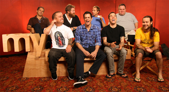 or even out of space.
5. It's one of the best instances where the logo describes what it actually means/says.
6. my place in the space. Find your place in the world.
7. my______ (write your point of view, you get your chance now)
conclusion: my life, my music, my game, my rules.
Oct 3, 2010
Milionarul Mioritic - pe-o gura de rai
Bantuind pe net am dat de un site foarte interesant. Siteul se numeste Milionarul Mioritic si are urmatorul logo:
 Foarte spiritual logoul. Cum transhumanta ne este in sange, de ce sa nu ne fie si in finante. Ideea mi s-a parut geniala, insa as avea cateva aprecieri negative (din pacate). Oricum valoarea lui este inestimabila pentru popor. Sa purcedem deci:
1. dolarul nu mai este la moda. Inteleg alegerea pentru ca trebuia sa se sprijine intr-un bat si nu se putea propti in €. Desi putea sa faca un euro imbracat in oaie...
2. grosimea liniei folosite la dolar cu cea cu care este construit omul sunt foarte diferite si provoaca o ruptura
3. contextul in care este folosit iarasi este fragmentar. Fontul ales nu se potriveste deloc cu simbolul.
 4. nu am gasit pe site nici un alt material derivat din acest concept. As fi vrut sa gasesc contul de twitter mai cret decat de obicei, sau orice alta asociere cu tema data. Pacat de potentialul pe care il are conceptul.
Oricum felicitari pentru idee si pana una alta mai faceti si voi o finanta personala.
 Foarte spiritual logoul. Cum transhumanta ne este in sange, de ce sa nu ne fie si in finante. Ideea mi s-a parut geniala, insa as avea cateva aprecieri negative (din pacate). Oricum valoarea lui este inestimabila pentru popor. Sa purcedem deci:
1. dolarul nu mai este la moda. Inteleg alegerea pentru ca trebuia sa se sprijine intr-un bat si nu se putea propti in €. Desi putea sa faca un euro imbracat in oaie...
2. grosimea liniei folosite la dolar cu cea cu care este construit omul sunt foarte diferite si provoaca o ruptura
3. contextul in care este folosit iarasi este fragmentar. Fontul ales nu se potriveste deloc cu simbolul.
 4. nu am gasit pe site nici un alt material derivat din acest concept. As fi vrut sa gasesc contul de twitter mai cret decat de obicei, sau orice alta asociere cu tema data. Pacat de potentialul pe care il are conceptul.
Oricum felicitari pentru idee si pana una alta mai faceti si voi o finanta personala.
Sep 25, 2010
Biodiersity
 2010 - The international Year of Biodiversity.
I believe it's a very well integrated logo. Very compact and very complex in the same time. Describing diversity through members of the species but in the same time drawing the numbers of the year. What seems funny to me is the human beings stand under a protection, the roof of number 1. Which is not at all the case. On the contrary, this is the problem.
What is biodiversity:
"Biological diversity - or biodiversity - is the term given to the variety of life on Earth and the natural patterns it forms.
You are an integral part of nature; your fate is tightly linked with biodiversity, the huge variety of other animals and plants, the places they live and their surrounding environments, all over the world." To read the hole story visit the official page.
Some other designs on the theme of biodiversity:


And this reminds me of a local product: Gusto Puffs. If you notice the writing of the text "cu surprize", it's made out of a special animal font. So you'll feel better when eating them, they are bio..diversified Puffs.

Sep 23, 2010
I'm bad, I'm bad, I'm a baby carrot
 This is an attempt to make carrots junk food. Do you think they will succeed? I'd love to crack a baby carrot.
I can see Michael Jackson dancing here. Because I'm bad, I'm bad...
source
Sep 21, 2010
Political Tea - Flower Power is back (but in other ways that you would expect it)
Because there were election in Sweden (on Sunday, 19th) i found it appropriate to write about a subject I've been meaning to write since Stockholm's Pride Parade. I won't write about politics, but i will write about the image (purely graphic) of the parties in Sweden.
This is how the general picture looks like (the 8th most important parties):
 There are a lot of flowers, don't you think? Let's just take them one by one.
Moderate Party:
 The logo itself expresses moderation and connection. You could even say peace, because there is always a line and a circumstance that can unify different opinion. The only problem i have with this logo is that resembles with a Metro (subway) entrance.
The Liberal Party:
 Almost looks like a flower blooming, growing, expanding. And I think the colors are important here. Two shades of blue says "we can live together".
The Center Party:
 The problem i have is that it's not at all centered. It's a little to the left. But it's still from floral/ vegetal inspiration.
The Christian Democrats:
 Also a flower, but i don't know the background of it's meaning. Maybe it is a symbol.
The Social Democratic Party:

This and the Moderate Party are the only logos that doesn't come any close to a floral motive. But nevertheless is very expressive and memorable one. It has written social all over.
A friend of mine suggested that this is a rose. And it's normal to be, because social democrats usually have a rose for a symbol. But most of the time is a plain rose, sometimes hold in a hand. In the light of the new discovery I like it even better - it's so abstract, it's a representation of a symbol, it's more than the original. And the social component is there also. So another flower on the roll. But this time it talks.
The Green Party:
 A flower, of course. And a very common one. Why do you think they chose this?
The Left Party:
 V comes from "vänster" the swedish word for left. The motif is also a flower.
The Sweden Democrats:
 QED
QED
In the end it would be interesting to analyze the colors (4 blue, 2 green and 2 red) and to measure the white space in the design and also the flower shape. What exactly do they stand for. But i think you can recognize for yourself the flower type and have your own image attached to it.
What was surprising for me is this picture taken at Pride Parade in Stockholm 2010:

As you can see there are the Social Democrat, Green and Left Parties logos, only adapted to the parade. And this is when questions started to come (without knowing what they really stand for, i found out later). I think the initiative is very good, and there is one more thing that is to appreciate: they are recognizable! Which i think is a great deal.
And I will add this for the friends that will say i discriminated against the Pirate Party, but i don't think they have a voice.

The source for this article (both graphical and informational) is the official Guide to Sweden.
This is how the general picture looks like (the 8th most important parties):
 There are a lot of flowers, don't you think? Let's just take them one by one.
Moderate Party:
 The logo itself expresses moderation and connection. You could even say peace, because there is always a line and a circumstance that can unify different opinion. The only problem i have with this logo is that resembles with a Metro (subway) entrance.
The Liberal Party:
 Almost looks like a flower blooming, growing, expanding. And I think the colors are important here. Two shades of blue says "we can live together".
The Center Party:
 The problem i have is that it's not at all centered. It's a little to the left. But it's still from floral/ vegetal inspiration.
The Christian Democrats:
 Also a flower, but i don't know the background of it's meaning. Maybe it is a symbol.
The Social Democratic Party:

A friend of mine suggested that this is a rose. And it's normal to be, because social democrats usually have a rose for a symbol. But most of the time is a plain rose, sometimes hold in a hand. In the light of the new discovery I like it even better - it's so abstract, it's a representation of a symbol, it's more than the original. And the social component is there also. So another flower on the roll. But this time it talks.
The Green Party:
 A flower, of course. And a very common one. Why do you think they chose this?
The Left Party:
 V comes from "vänster" the swedish word for left. The motif is also a flower.
The Sweden Democrats:
 QED
QEDIn the end it would be interesting to analyze the colors (4 blue, 2 green and 2 red) and to measure the white space in the design and also the flower shape. What exactly do they stand for. But i think you can recognize for yourself the flower type and have your own image attached to it.
What was surprising for me is this picture taken at Pride Parade in Stockholm 2010:

As you can see there are the Social Democrat, Green and Left Parties logos, only adapted to the parade. And this is when questions started to come (without knowing what they really stand for, i found out later). I think the initiative is very good, and there is one more thing that is to appreciate: they are recognizable! Which i think is a great deal.
And I will add this for the friends that will say i discriminated against the Pirate Party, but i don't think they have a voice.
The source for this article (both graphical and informational) is the official Guide to Sweden.
Sep 18, 2010
De ce e nevoie de mai multi barbati sa imbrace o femeie?
In Bucuresti la Muzeul Taranului Roman s-a deschis expozitia "Construction", expozitie realizata de artisti norvegieni si adusa in Romania cu ajutorul Ambasadei Norvegiei. Piesa cea mai interesanta este o constructie, mai bine zis o rochie construita dintr-un element foarte masculin - gulere de camasa.

Artista (Marit Helen Akslen) a folosit 250 de gulere pentru aceasta piesa simbol. De obicei spunem ca "in spatele fiecarui barbat puternic este o femeie puternica". Cazul de fata ne face sa ne gandim la o schimbare de paradigma.

#
Rochia prezentata poate trece usor drept o rochie de mireasa. Si aici avem de-a face cu alta semnificatie.
#
A treia directie la care ma gandesc este conceptul de gulere albe in sociologie:
"Pentru cei mai mulţi sociologi, gulere albe reprezintă noua clasă de mijloc în societăţile industriale avansate. Ea înglobează o categorie largă şi eterogenă de ocupaţii tehnice, funcţionăreşti, administrative, terţiare etc., caracterizate prin munci non-manuale şi printr-o stratificare internă destul de accentuată: la nivelurile inferioare vînzători, dactilografe, desenatori, contabili etc., la cele medii tehnicieni, maiştri, supraveghetori ş.a., iar la nivelurile superioare toate categoriile de profesii considerate liberale (medici, profesori, avocaţi, arhitecţi, precum şi manageri de diferite ranguri)." sursa
Si atunci ma gandesc la o corporatie. Cum 250 de oameni muncesc pentru ca doamna care conduce compania, sau sotia liderului, sa aiba acces la ceva ce ei nu au.
Si lista de presupuneri poate continua. Sper doar ca o sa va vina idei de la aceasta piesa si o sa va inspire, mai ales cand vine vorba de construit.

Artista (Marit Helen Akslen) a folosit 250 de gulere pentru aceasta piesa simbol. De obicei spunem ca "in spatele fiecarui barbat puternic este o femeie puternica". Cazul de fata ne face sa ne gandim la o schimbare de paradigma.

#
Rochia prezentata poate trece usor drept o rochie de mireasa. Si aici avem de-a face cu alta semnificatie.
#
A treia directie la care ma gandesc este conceptul de gulere albe in sociologie:
"Pentru cei mai mulţi sociologi, gulere albe reprezintă noua clasă de mijloc în societăţile industriale avansate. Ea înglobează o categorie largă şi eterogenă de ocupaţii tehnice, funcţionăreşti, administrative, terţiare etc., caracterizate prin munci non-manuale şi printr-o stratificare internă destul de accentuată: la nivelurile inferioare vînzători, dactilografe, desenatori, contabili etc., la cele medii tehnicieni, maiştri, supraveghetori ş.a., iar la nivelurile superioare toate categoriile de profesii considerate liberale (medici, profesori, avocaţi, arhitecţi, precum şi manageri de diferite ranguri)." sursa
Si atunci ma gandesc la o corporatie. Cum 250 de oameni muncesc pentru ca doamna care conduce compania, sau sotia liderului, sa aiba acces la ceva ce ei nu au.
Si lista de presupuneri poate continua. Sper doar ca o sa va vina idei de la aceasta piesa si o sa va inspire, mai ales cand vine vorba de construit.
Sep 17, 2010
Vodafone
Pentru ca am fost ieri la #webstock10 am vazut rosu in fata ochilor (nu e de rau, dar atat logoul Webstock cat si sponsorul principal, Vodafone, au culoarea brandului rosu, deci totul a fost rosu). Asa ca am hotarat sa vorbesc despre Vodafone ca brand, atat visual, cat si ca semnificatie..

O sa incep cu numele
"The name Vodafone comes from voice data fone, chosen by the company to "reflect the provision of voice and data services over mobile phones"." sursa
Sa ne gandim, "voce" si "date". Asta face brandul atat de actual, mai ales in contextul in care ieri Lidia Solomon de la Vodafone Romania vorbea despre orientarea (shiftul) catre internet.
Trebuie sa recunosc ca m-am gandit la provenienta numelui, inainte sa stiu asta si nu-mi venea in minte decat "voda", cuvant care in slovaca, bulgara, etc inseamna "apa". Desi ca brand nu avea nici legatura cu limbile slavone, o data ce ai fost si le-ai auzit e greu sa nu faci asocierea. Si inconstient incercam sa asociez apa cu telefonia, ceva de genul "unde e apa ai si semnal". Desi erau ganduri indepartate, erau intuitive, iar asocierea exista.
Visual.
Mie imi seamana cu o virgula. Intoarsa ce-i drept, dar tot virgula ramane. Si ce inseamna asta? Intuitiv as putea spune ca este conversatia care nu se termina. Nu se pune punct.
varianta 2:
Mai seamana cu o bula de discutie, doar ca iarasi e invers. Ca si cand vocea vine de sus. Ma opresc aici cu speculatia, ca nu vreau sa ma gandesc cine vorbeste de acolo. Dar poate aveti voi alte idei.

O sa incep cu numele
"The name Vodafone comes from voice data fone, chosen by the company to "reflect the provision of voice and data services over mobile phones"." sursa
Sa ne gandim, "voce" si "date". Asta face brandul atat de actual, mai ales in contextul in care ieri Lidia Solomon de la Vodafone Romania vorbea despre orientarea (shiftul) catre internet.
Trebuie sa recunosc ca m-am gandit la provenienta numelui, inainte sa stiu asta si nu-mi venea in minte decat "voda", cuvant care in slovaca, bulgara, etc inseamna "apa". Desi ca brand nu avea nici legatura cu limbile slavone, o data ce ai fost si le-ai auzit e greu sa nu faci asocierea. Si inconstient incercam sa asociez apa cu telefonia, ceva de genul "unde e apa ai si semnal". Desi erau ganduri indepartate, erau intuitive, iar asocierea exista.
Visual.
Mie imi seamana cu o virgula. Intoarsa ce-i drept, dar tot virgula ramane. Si ce inseamna asta? Intuitiv as putea spune ca este conversatia care nu se termina. Nu se pune punct.
varianta 2:
Mai seamana cu o bula de discutie, doar ca iarasi e invers. Ca si cand vocea vine de sus. Ma opresc aici cu speculatia, ca nu vreau sa ma gandesc cine vorbeste de acolo. Dar poate aveti voi alte idei.
Antena 1 ..branding
You call "zis" a rebranding? Pe principul zis si facut.
OLD:
 NEW:
NEW:

de mentionat:
1. Nu neg ca arata mai bine (dar nu este un rebranding, este o stilizare)
2. Pot sa vad foarte bine exprimat "impreuna" prin suprapunerea celor doua simboluri "1" si "a"(care oricum existau si inainte), a si 1 sunt impreuna, dar de aici pana la "mereu aproape" e cale lunga
3. Ceva nu e in regula in povestea asta. Sunteti siguri ca e un "re"branding profesionist?
citez:
Antena 1 lanseaza noua identitate a brandului menita sa reflecte pozitionarea statiei: televiziunea care face dintr-un simplu spatiu de locuit o adevarata casa a familiei (poate sa faca ce face IKEA, doar ca e pe baza de abonament). Cu alte cuvinte, oriunde te afli (oriunde acasa sau pe strada?), orice faci (serios? daca iti bati copiii?), te simti ca acasa daca ai alaturi pe cineva drag si, desigur, Antena 1.
Brandul isi pastreaza identitatea vie, tocmai pentru ca rolul sau in viata telespectatorului este unul activ: il ghideaza (ii si consiliaza?), il binedispune, il intelege, il sprijina, il apropie de familie (daca familia se destrama, nu-i nimic, ne uitam impreuna la Antena 1).
cateodata cred ca ne luam prea in serios..
OLD:
 NEW:
NEW:
de mentionat:
1. Nu neg ca arata mai bine (dar nu este un rebranding, este o stilizare)
2. Pot sa vad foarte bine exprimat "impreuna" prin suprapunerea celor doua simboluri "1" si "a"(care oricum existau si inainte), a si 1 sunt impreuna, dar de aici pana la "mereu aproape" e cale lunga
3. Ceva nu e in regula in povestea asta. Sunteti siguri ca e un "re"branding profesionist?
citez:
Antena 1 lanseaza noua identitate a brandului menita sa reflecte pozitionarea statiei: televiziunea care face dintr-un simplu spatiu de locuit o adevarata casa a familiei (poate sa faca ce face IKEA, doar ca e pe baza de abonament). Cu alte cuvinte, oriunde te afli (oriunde acasa sau pe strada?), orice faci (serios? daca iti bati copiii?), te simti ca acasa daca ai alaturi pe cineva drag si, desigur, Antena 1.
Brandul isi pastreaza identitatea vie, tocmai pentru ca rolul sau in viata telespectatorului este unul activ: il ghideaza (ii si consiliaza?), il binedispune, il intelege, il sprijina, il apropie de familie (daca familia se destrama, nu-i nimic, ne uitam impreuna la Antena 1).
cateodata cred ca ne luam prea in serios..
Mariuca de la Tnuva este noua Marioara de la Gorj
Ca tot a fost luna Mariei, are si Mariuca drepturi. Si ca o tarancuta ce e, a venit la oras si locuieste in frigiderele de la marketul din colt.

Sper sa revin cu poze mai bune, asta daca nu isi ia conversii, iPodul si ia si ne lasa cu buza umflata.
Mi-a placut mult sa vad noul iaurt Mariuca. Refreshing si amuzant. Dar cumva vreau sa aud povestea mai departe. Protagosnista noastra este intre doua lumi (in stanga sunt casele de la tara, iar in dreapta este orasul spre care merge). Este fata emancipata de la sat, care ajunsa la oras are multe de recuperat.
Intrebarea e daca vrei sa fi "codas la oras sau in satul tau fruntas"? Asta face brandul putin cam retro. Parintii nostri au facut asta si empatizeaza cel mai bine cu situatia.
Facts:
Numelde de Mariuca e scris cu diacritice, sa va uitati atent. (un font foarte retro de altfel)
Pe casa din stanga e un cocos
NU inteleg:
de ce are 3 degete la mana
de ce are iPod albastru
In rest sa auzim de bine. Asteptam si consatenii: Nelutu', Fanel si cum zice un prieten de-al meu - Mita lui Tiribomba.

Sper sa revin cu poze mai bune, asta daca nu isi ia conversii, iPodul si ia si ne lasa cu buza umflata.
Mi-a placut mult sa vad noul iaurt Mariuca. Refreshing si amuzant. Dar cumva vreau sa aud povestea mai departe. Protagosnista noastra este intre doua lumi (in stanga sunt casele de la tara, iar in dreapta este orasul spre care merge). Este fata emancipata de la sat, care ajunsa la oras are multe de recuperat.
Intrebarea e daca vrei sa fi "codas la oras sau in satul tau fruntas"? Asta face brandul putin cam retro. Parintii nostri au facut asta si empatizeaza cel mai bine cu situatia.
Facts:
Numelde de Mariuca e scris cu diacritice, sa va uitati atent. (un font foarte retro de altfel)
Pe casa din stanga e un cocos
NU inteleg:
de ce are 3 degete la mana
de ce are iPod albastru
In rest sa auzim de bine. Asteptam si consatenii: Nelutu', Fanel si cum zice un prieten de-al meu - Mita lui Tiribomba.
Sep 12, 2010
growing human (best logo in Amsterdam)
I declare this the best logo in Amsterdam (Tropentheatre in Amsterdam):

It's amazing. I could get lost just watching this logo and thinking about all the meaning.

from their website: "The Tropentheater is the best place for concerts, dance performances, theater, youth theater and films from non-Western countries and the fringes of Europe."
The name translates as the Tropics Theater. Obviously the name it's the statement regarding the content of the performances they have in their program (non-western, but i would say even non-european).
If you look at the logo, you will see human shapes, as captured from their movement and performance. It could be dance, theater or film. Or even lecture (look at the to shapes standing in the bottom). And together they form a tree, a human tree. Or even better, they are united in a tree, in a common ground, in a growing environment. It's about expression and unity in the same time.
It also gives me the impression of floating or flying. Of relaxation, freedom and self expression. It's also about growing, growing like artists, like humans, like a planet.
And then we can talk about derivations:

Using the same pattern, the same concept of connectivity you can keep on adding to the design.
Hope you like it.
*photos taken in Amsterdam, august 2010

It's amazing. I could get lost just watching this logo and thinking about all the meaning.

from their website: "The Tropentheater is the best place for concerts, dance performances, theater, youth theater and films from non-Western countries and the fringes of Europe."
The name translates as the Tropics Theater. Obviously the name it's the statement regarding the content of the performances they have in their program (non-western, but i would say even non-european).
If you look at the logo, you will see human shapes, as captured from their movement and performance. It could be dance, theater or film. Or even lecture (look at the to shapes standing in the bottom). And together they form a tree, a human tree. Or even better, they are united in a tree, in a common ground, in a growing environment. It's about expression and unity in the same time.
It also gives me the impression of floating or flying. Of relaxation, freedom and self expression. It's also about growing, growing like artists, like humans, like a planet.
And then we can talk about derivations:

Using the same pattern, the same concept of connectivity you can keep on adding to the design.
Hope you like it.
*photos taken in Amsterdam, august 2010
Sep 8, 2010
Say hello to the stars - ARCA
Pe plan local avem parte de un nou rebranding. Este vorba de Asociatia Romana pentru Cosmonautica si Aeronautica (ARCA). Din punctul meu de vedere este mai mult o stilizare, o reimprospatare a identitatii Asociatiei. (vezi foto).
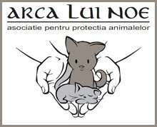
 Am inceput o cautare pentru ARCA. Numele este generalist si des folosit. Mai ales ca exista semnificatiile legate de Arca lui Noe. Pentru un rebranding sanatos cred ca era nevoie de diferentiere.
Logouri si Asociatii care se leaga de ARCA:


 Cum era daca se foloseau de numele asociatiei?
"ÁRCĂ árce f. Vas mare cu panze, folosit, in trecut, la transport."
Mi-ar fi placut sa vad o nava care sa ne poarte catre stele. Aceleasi stele care apar acum in design.
Concluzie: imi place transformarea, e un progres, dar e facut pe fuga.
*Rebranging realizat de Grapefruit, 2010.
 Am inceput o cautare pentru ARCA. Numele este generalist si des folosit. Mai ales ca exista semnificatiile legate de Arca lui Noe. Pentru un rebranding sanatos cred ca era nevoie de diferentiere.
Logouri si Asociatii care se leaga de ARCA:


 Cum era daca se foloseau de numele asociatiei?
"ÁRCĂ árce f. Vas mare cu panze, folosit, in trecut, la transport."
Mi-ar fi placut sa vad o nava care sa ne poarte catre stele. Aceleasi stele care apar acum in design.
Concluzie: imi place transformarea, e un progres, dar e facut pe fuga.
*Rebranging realizat de Grapefruit, 2010.
Subscribe to:
Posts (Atom)